Awesome Plotly with Code Series (Part 3): Highlighting Bars in the Long Tails
Who said that the longer tails are not important? Let’s give them a proper way to stand out

Welcome to the third post in my “Plotly with code” series! If you missed the first one, you can check it out in the link below, or browse through my “one post to rule them all” to follow along with the entire series or other topics I have previously written about.
- Awesome Plotly with Code Series (Part 1): Alternatives to Bar Charts
- All my written articles in one place
A short summary on why am I writing this series
My go-to tool for creating visualisations is Plotly. It’s incredibly intuitive, from layering traces to adding interactivity. However, whilst Plotly excels at functionality, it doesn’t come with a “data journalism” template that offers polished charts right out of the box.
That’s where this series comes in — I’ll be sharing how to transform Plotly’s charts into sleek, professional-grade charts that meet data journalism standards.
PS 1: I have no affiliation with Plotly. It is simply my day to day go-to open source library tool. In addition, a lot of inspiration comes from open source content like the one that AddTwoDigital agency provides (again no affiliation here either, just an appreciation on free available content).
PS 2: all images are authored by me unless otherwise specified
A small but really important bar
When someone thinks about bar charts, they often think about tangible and easy to detect bars. But, what about the underdog, the little bar that quietly sits at the end of the lineup? Sure, it may have a low value, but it can tell a compelling story.
However, highlighting such a small bar when it is surrounded by bigger bars and numbers, can be difficult. In this post, I’ll show you how to give that small but mighty bar the spotlight it deserves using Plotly. After all, in data visualisation, it’s not just about the size; it’s about the significance!
What will we cover in this blog?
- You will see how colouring these small bars is not enough.
- You will see how we can use the concept of “highlighting” to make these bars stand out.
PS: As always, code and links to my GitHub repository will be provided along the way. Let’s get started!
Colouring bars is not enough
In my previous post Awesome Plotly with code series (Part 2): Colouring bar charts, we covered how we could use colour contrast to get the reader to focus on a specific area of the bar chart. However, that was under the assumption that there was a big enough bar to actually see the colour contrast.
Imagine that we are looking at a series of data where lower numbers are actually the best possible outcome. For instance, during Covid, having a low death rate per 100k patients was the goal. Most countries in the world suffered having high numbers on this metric, except a few countries, for example, China. This is what the data looks like.
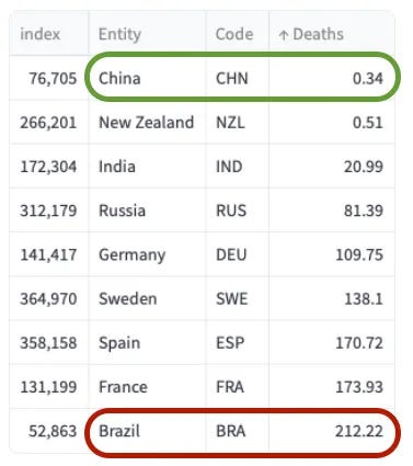
You will see later what the bars look like, but you can check in the default plot below how tiny is the China and New Zealand bar compared to the Brazil bar. Brazil had a 200x death rate compared to China!!
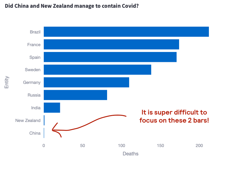
Theory: colour contrast should be useful, but how do we use it?
- Colour contrast is a pre-attentive visual attribute. The human brain is wired to immediately pick out differences in our environment. For bar charts, our brains would try to naturally compare the size and the colour of the bars. Therefore, by using a different colour for China and New Zealand, we should direct the readers attention directly to their respective bars.
- BUT, if the bars are small enough, it doesn’t matter how you colour them. Your brain will try to focus on differences for the bars it can detect. For example, it will look at Brazil vs France.
The first attempt — Colour the small bars
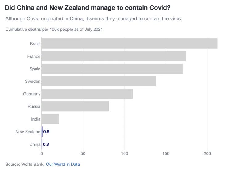
In the chart below, you will see the effects we have just been talking about. As best practice indicates, we have highlighted NZ and China with another colour and added their data labels next to the bars. However:
- Because the size of the bars is so small compared to the Brazil bar, it is difficult to actually detect the different colour.
- In fact, every time I see this chart, whilst my eyes are somewhat drawn to NZ and China, they are also going up again to the bigger bars. Maybe it’s because my brain is lazy, but I do need to concentrate to actually keep my eyes focused on such tiny bars.
The solution — Highlighting
Remember when you were back at school or in university, and you faced a beefy book or a big chunk of A4 papers? They were all covered in writing, with no contrast. What did I do in this instances? Pull out my magic highlighter.
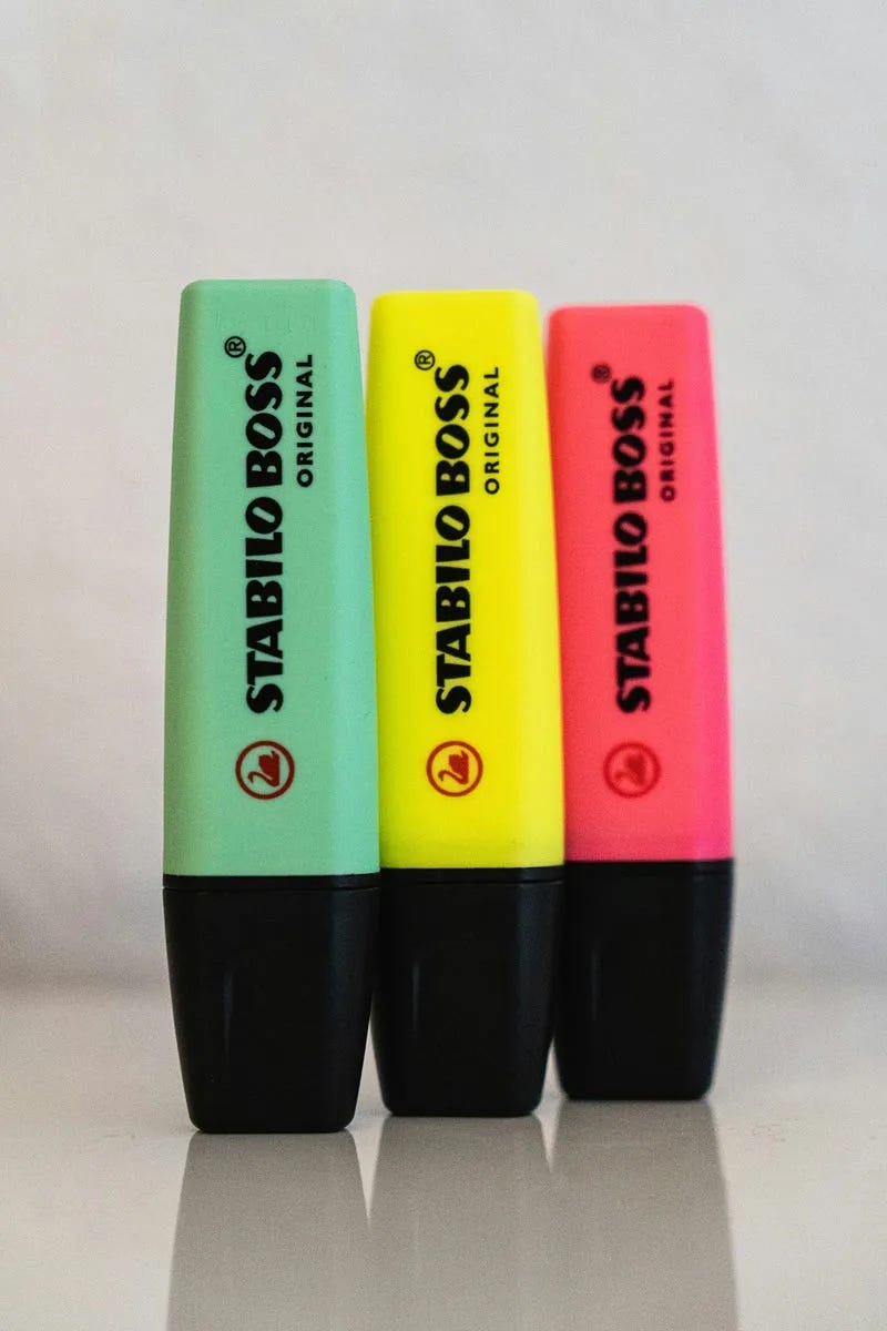
If we take this as an inspiration and still have in mind how colour contrast can help us, then we can think of adding a highlighted area for China and New Zealand. Below is my proposed solution.
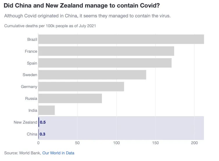
Why do I think this plot is better?
- By highlighting NZ and China with the same width as Brazil, we adding colour contrast to a big area. Our eyes easily detect it.
- In addition, once the eyes have detected this colour contrast and focus their attention to NZ and China, they now have an easier job making a comparison against Brazil. This is because we dont necessarily have to scroll our eyes from small bars at the bottom, to the big bar at the top. We already have the Brazil width at the same level as the China and NZ category.
Tips on how to create this plot
How to colour bars differently and adding specific text labels
- Simply use a list comprehension for the marker_color and text parameters
fig = go.Figure(
  data=[
      go.Bar(
        y=df['Entity'],
        x=df['Deaths'],
        marker_color=['rgb(18, 22, 122)' if c_ in ['China', 'New Zealand'] else 'lightgrey' for c_ in df['Entity']],
        orientation='h',
        text=[f'<b>{deaths:,.1}</b>' if entity in ['China', 'New Zealand'] else '' for deaths, entity in zip(df['Deaths'], df['Entity'])],
        textfont=dict(color='rgb(18, 22, 122)'),
        textposition='outside',
        showlegend=False,
      )
  ]
)
How to highlighting China and NZ
- 1st, you need to locate in which position is China located. Remember, this is a category, so we need to find where China is being plotted.
- 2nd, once you have that, because you want to create a rectangle, you need to specify the height. For that we calculate y0 and y1. I have done that by adding and substracting 0.5 from the index.
- 3rd, add a shape, ensuring that the layer=”below”
china_index = df[df['Entity'] == 'China'].index[0]
y0 = china_index - 0.5
y1 = china_index + 0.5

fig.add_shape(
    type="rect",
    x0=0,
    x1=df['Deaths'].max(),
    y0=y0,
    y1=y1,
    fillcolor="rgba(18, 22, 122, 0.3)",
    opacity=0.5,
    layer="below",
    line_width=0,
)
Summary
In this post, we explored how to make small but significant bars stand out in bar charts using Plotly. While color contrast alone may not be enough when dealing with tiny bars, combining it with highlighting techniques can guide the viewer’s attention to critical data points. The key takeaway?
Sometimes, even the smallest data points deserve to be seen
And with the right visual tools, they can be. Now, you’re equipped with techniques to transform your charts and help those long-tail values shine.
Where can you find the code?
In my repo and the live Streamlit app:
Data sources
- Source: Our World in Data (CC BY 4.0)
Further reading
Thanks for reading the article! If you are interested in more of my written content, here is an article capturing all of my other blogs posts organised by themes: Data Science team and project management, Data storytelling, Marketing & bidding science and Machine Learning & modelling.
All my written articles in one place
Stay tuned!
If you want to get notified when I release new written content, feel free to follow me on Medium or subscribe to my Substack newsletter. In addition, I would be very happy to chat on Linkedin!
- Get notified with my latest written content about Data Science!
- Jose's Substack | Jose Parreño Garcia | Substack
Originally published at https://joseparreogarcia.substack.com.
Awesome Plotly with Code Series (Part 3): Highlighting Bars in the Long Tails was originally published in Towards Data Science on Medium, where people are continuing the conversation by highlighting and responding to this story.
from Datascience in Towards Data Science on Medium https://ift.tt/pZGb8Az
via IFTTT


