Data Visualization Techniques for Healthcare Data Analysis — Part III
Data Visualization Techniques for Healthcare Data Analysis — Part III
Mastering data visualization: from effective bar charts to common pitfalls like 3D visualizations
Overview
We are now embarking on a project focused on data visualization techniques. Think of this project as an extension of Techniques in Feature Engineering: Real-World Healthcare Data Challenges — Part I & Part II.
Building on these results, we will perform a comprehensive data exploration, analysis, with the focus now specifically on data analysis through visualization.
I will introduce a variety of charts and also bring up some minor issues, along with tips on when to use certain types of charts depending on the information you want to convey.
GitHub - Anello92/feature-engineering-techniques-python
By the end, you’ll gain essential knowledge on building truly effective data visualizations, skills that will be invaluable in day-to-day tasks. Ready?
Table of Contents
- Python Libraries and Setup
- Initial Exploration: Shape, Types, and Summary
- Bar Charts: Use Cases and Best Practices
- Count Plots: Displaying Categorical Totals
- Crosstabs and Proportions: Normalizing Data for Clarity
- Scatter Plots: Exploring Variable Relationships
- Histograms: Visualizing Frequency Distributions
- CatPlots: Multi-Variable Analysis
- FacetGrid: Handling Multiple Dimensions in a Single Visualization
- Charts to Avoid: The Pitfalls of 3D Visualizations
- Stacked Histograms: Why Simplicity Matters
- Over-Complex Charts: When Too Much Is Too Much
- Comparison: Effective vs. Ineffective Charts
- Single-Tone Bar Charts vs. Over-Colored Charts
- 2D Scatter Plots vs. 3D Alternatives
- Maximum Clarity: Choosing Colors and Labels
- When and Why to Add Totals to Charts
- Avoiding Visual Clutter
- Delivering the Analysis Results
Python Packages Used in the Project
You may have noticed this already, but let me highlight it explicitly.
With just these four packages, you can create a comprehensive data analysis platform in Python:
# 1. Imports
import numpy as np
import pandas as pd
import matplotlib.pyplot as plt
import seaborn as sns
import warnings

# 2. Ignore warnings for clean output
warnings.filterwarnings('ignore')
NumPy and Pandas for data manipulation, and Matplotlib and Seaborn for visualizations. In nearly every project, these two pairs are fundamental, allowing us to perform analyses across various datasets, projects, and objectives.
These four packages form a robust open-source data analysis platform. NumPy and Pandas handle data manipulation, while Seaborn and Matplotlib take care of visualizations.
Seaborn excels in statistical charts, while Matplotlib provides more general-purpose charting. Notably, Seaborn relies on Matplotlib, meaning Seaborn-generated charts utilize Matplotlib’s libraries internally.
If visually intricate or interactive charts are not a priority, Seaborn and Matplotlib cover most data analysis needs. For enhanced aesthetics or interactivity, consider Plotly as an alternative — also in Python.
It ultimately depends on your goal: if you seek detailed data analysis with customized charts, Matplotlib and Seaborn are ideal. For more visually appealing and interactive charts, Plotly may be a better choice.
Let’s load these essential packages, and then activate the Watermark extension:
%reload_ext watermark
%watermark -a "panData"
Loading the Data
I retrieved the CSV file from the previous project — our prior output will now serve as the input for this project.
So, let’s proceed with loading the dataset for our data analysis work.
# 3. Loading the data
data = pd.read_csv("project_result.csv")
With the data loaded, let’s examine the first few rows of the dataset, showing all our previous work:
# 4. Viewing the data
data.head()

Now, let’s check the shape, which reveals the number of rows and columns:
# 5. Shape
data.shape

# (68629, 22)
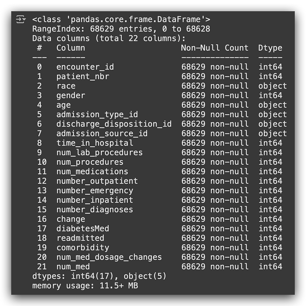
And finally, let’s get the statistical summary:
# 6. Info
data.info()
We’re now ready to start building visualizations.
Visualization, Interpretation, and Data Analysis
Here’s my proposed solution for data visualization. While there are many possible charts, I’ll explain my choice, detailing why I selected each type of chart and pointing out common pitfalls to avoid in chart creation.
In this notebook, dataviz_pt3, I’ll walk you through each chart step-by-step, explaining the rationale behind each choice, the data preparation process, and key data visualization techniques along the way.
1. Total Medications Consumed by Age Group
How many variables do we have here? Two: the total medications and age group, which is a categorical variable.
In this case, a bar chart is a suitable choice, as it’s both easy to interpret and straightforward to create — benefiting both you and your audience.
I chose to color the bars to clearly distinguish each category, represented by age group.
# 7. Colored Bar Chart

# Figure size
plt.figure(figsize = (16,7))

# Creating the bar chart
figx = sns.barplot(x = 'age', y = 'num_med', estimator = np.sum, data = data)

# x-axis label
plt.xlabel("\nAge Group", fontsize = 14, color = 'black')

# y-axis label
plt.ylabel("Total Medications Consumed", fontsize = 14, color = 'black')

# Title
plt.title("Total Medications Consumed by Age Group", fontsize = 14, color = 'black')

# Adding total values as labels on each bar
for p in figx.patches:
    figx.annotate('{:.0f}'.format(p.get_height()),
                  (p.get_x() + 0.2, p.get_height()),
                  ha = 'center',
                  va = 'bottom',
                  fontsize = 14,
                  color = 'black')

# Displaying the chart
plt.show()
First, I set the figure size, which defines the plotting area.
Then, I use Seaborn to create a barplot, utilizing age for the x-axis and num_med (number of medications) for the y-axis, calculating the sum directly within barplot using np.sum.
This approach minimizes code lines by specifying the operation (np.sum) and dataset within the plot function. The rest is chart formatting: x-axis, y-axis, and title.
The annotate function adds total values on each bar, marking the total medications consumed per age group.
- The 70–80 age group consumes the most medications.
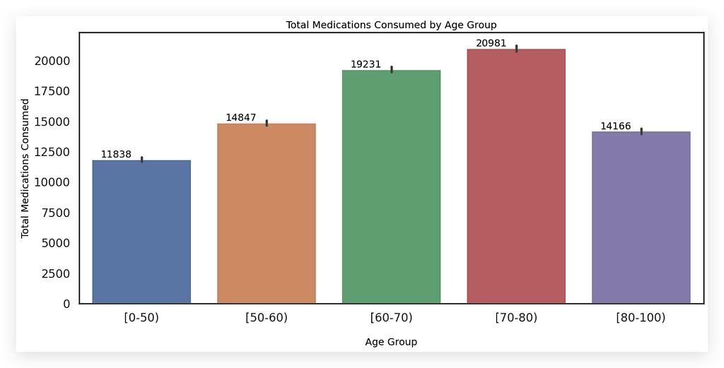
Why a bar chart? It effectively illustrates the relationship between a numerical and a categorical variable, making it an ideal choice here (though not the only one).
Why use colors? Each color represents a category, reinforcing the visual distinction. Colors are essential for conveying information — often overlooked.
Here, each age group has a unique color for clarity, using soft tones (the Seaborn default) to avoid overwhelming the viewer.
However, remember: colored bars aren’t always necessary. If preferred, you can use a single color, relying on bar height to indicate values.
Avoid over-coloring, as it can clutter the chart. Since there are only five categories here, with soft hues, the chart remains visually pleasing and easy to understand.
Key Tip: Charts should minimize the need for interpretation. If viewers have to interpret too much, the chart may not be effective.
Here, the x-axis shows age group, the y-axis shows total medications, and each bar’s color denotes a distinct category. This eliminates interpretation — information is conveyed directly.
If a chart requires excessive interpretation, that’s likely a signal of a problem.
2. Total of Readmissions of Diabetic Patients by Gender
Here, we want the total readmissions of diabetic patients by gender. For this, I chose a CountPlot, which resembles a bar chart.
However, it’s specifically designed to display counts, making it ideal for showing totals in a chart.
There’s an important detail here. Since we’re categorizing by gender, in the dataset, gender is represented by 0 or 1.
How should we display this in the labels? Showing just 0 or 1 would leave users asking what these values mean. Instead, we’ll label these as Female and Male.
Prepare your chart in advance to reflect this so that the final audience doesn’t have to interpret 0 or 1.
# 8. Count Plot (Bar Chart for Categorical Variables)

# 8a. Creating the bar chart with label encoding
figx = sns.countplot(x = [('Female Gender' if x == 0 else 'Male Gender') for x in data['gender']],
                     hue = 'readmitted',
                     data = data)

# Figure size in inches
figx.figure.set_size_inches(10,7)

# Legend
figx.legend(title = 'Patient Readmitted', labels = ('No', 'Yes'))

# y-axis label
plt.ylabel("Total Readmissions", fontsize = 14, color = 'black')

# Title
figx.axes.set_title('Total Readmissions of Diabetic Patients by Gender')

# Adding total values as labels on each bar
for p in figx.patches:
    figx.annotate('{:.0f}'.format(p.get_height()),
                  (p.get_x() + 0.2, p.get_height()),
                  ha = 'center',
                  va = 'bottom',
                  fontsize = 14,
                  color = 'black')

# Displaying the chart
plt.show()
I’m utilizing our programming skills here. In #8a, I’m fetching data from the gender column in our dataset.
If the value equals 0, it represents Female; otherwise, it’s Male. This is done through a loop, or more precisely, a list comprehension.
The loop iterates through the data, dynamically changing the label as the chart is being created.
Notice that all of this is contained within the countplot, helping to save code lines. As you gain programming experience, you naturally find ways to reduce code lines.
I set the readmitted column for the color fill (the hue parameter), and specify the dataset. This setup produces a count plot displaying the total readmissions of diabetic patients by gender.
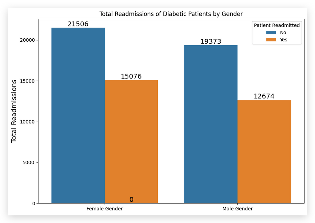
And here, we have color differentiation, indicating whether the patient was readmitted (Yes or No).
Each bar represents a count by gender, with Female or Male displayed accordingly. Female patients have a higher count of readmissions. So, who was readmitted more often? Female patients.
To finish the chart, I set the figure size in inches and add a legend (figx.legend) to the right corner. You can name the legend as you like; in this example, it serves to identify readmission status.
After that, I set the y-axis label, chart title, and totals on each bar. These totals are optional; however, I generally include them whenever possible to avoid the need for interpretation—the information is directly visible on the chart.
Using this chart as an analysis tool to convey information directly to the end user is a solid strategy. It’s a best practice to apply in your daily work.
Note, though, that this approach works here because we have only a few bars. If we had many, displaying totals on each bar might not make sense.
Do you always have to display totals on each bar? No — it depends. Ultimately, use good judgment. Can you easily see the information being conveyed? If no interpretation is needed, then the issue is resolved.
This is an ideal chart setup. For this scenario, a bar chart or count plot would be suitable since we need to divide both categories of one variable and categories of another variable, along with the totals.
When dealing with multiple pieces of information, be careful not to overpopulate the chart.
I’ve presented a practical strategy for dynamically changing labels, as in the Female and Male gender example, and using the count plot when displaying totals alongside a categorical variable in a chart.
Also, notice that I didn’t specify bar colors. Only the y-axis label color was set. When not specified, Seaborn or Matplotlib will automatically assign colors, which works well here, avoiding the need for extra customization.
3. Total Readmissions of Patients by Age Group
For this item, I used a single-color bar chart with Seaborn’s barplot, selecting salmon as the color.
You can choose any color you like by consulting the official Seaborn documentation, which includes nearly every imaginable color and its variations.
Why a single tone? I did this because I wanted to discuss an important aspect of data visualization with you. Which chart do you think looks better?
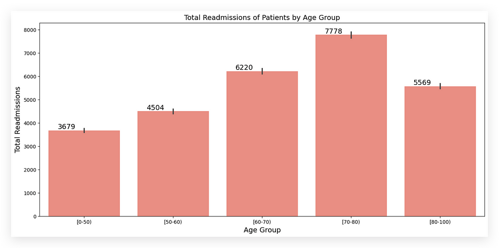

This chart on the left shows the total readmissions by age group, while the one on the right shows the total medications by age group.
Although the information differs, both use the same categorical variable, age group. In one, I used colored bars; in the other, a single color. So, which is better?
Ideally, whenever possible, use a single color. Why? It simplifies interpretation for the human brain. You’re not creating the chart for a machine but for people who will consume the results.
The closer the chart aligns with what the human brain expects, the more likely it will resonate with your audience.
Colored charts can be helpful, particularly for differentiating categories. But when possible, opt for a single color — it simplifies reading and allows distinctions based solely on bar height.

The information remains clear here. The height of each bar represents the total, which is the core message.
I could add more depth by using different colors for each bar, but sticking to one tone keeps the chart cleaner and easier to read, avoiding cognitive overload.
Too many colors can cause mental confusion — it’s just how our brains work. Different colors work best with fewer bars, as shown in item 1.
The takeaway here is that patients aged 70–80 have the highest readmission rates — the tallest bar already conveys this.
If necessary, I might add more visual depth by varying colors, depending on the information type.
There’s no hard rule; a good approach is to use light, soft colors or stick to one color to help the brain process the chart more easily, remembering you’re designing for human viewers.
As for the code:
# 9. Single-Color Bar Chart

# Figure size
plt.figure(figsize = (16,7))

# Creating the bar chart
figx = sns.barplot(x = 'age', y = 'readmitted', estimator = np.sum, data = data, color = 'salmon')

# x-axis label
plt.xlabel("Age Group", fontsize = 14, color = 'black')

# y-axis label
plt.ylabel("Total Readmissions", fontsize = 14, color = 'black')

# Title
plt.title("Total Readmissions of Patients by Age Group", fontsize = 14, color = 'black')

# Adding total values as labels on each bar
for p in figx.patches:
    figx.annotate('{:.0f}'.format(p.get_height()),
                  (p.get_x() + 0.2, p.get_height()),
                  ha = 'center',
                  va = 'bottom',
                  fontsize = 14,
                  color = 'black')

# Displaying the chart
plt.show()
We created the barplot, set the variables, used np.sum as the estimator for total readmissions, and chose salmon as the color.
Then, we added labels: x-axis, y-axis, title, and totals on each bar. Given the choice, I’d always prefer a single-color chart over a multi-colored one.
Colorful charts can sometimes hinder the clarity of information, while a single tone typically provides a clearer, safer option.
However, always consider your audience. If they need to focus on critical information, use color to draw attention.
Color naturally attracts attention, so if you’re presenting something urgent, breaking this single-color rule can be effective.
Otherwise, whenever possible, stick to one color across all bars.
4. % of Readmissions/Non-Readmissions of Patients by Age Group
The first step is to calculate the percentage. This information isn’t available directly in the dataset.
# 10. First, we calculate the percentages
age_readmission_percentage = pd.crosstab(data.age, data.readmitted, margins=True, normalize='index') * 100
age_readmission_percentage
So, I’ll create a crosstab containing age group and readmissions.
Then, I’ll calculate the margins and multiply by 100 to get the percentage values. This takes care of part of the problem.
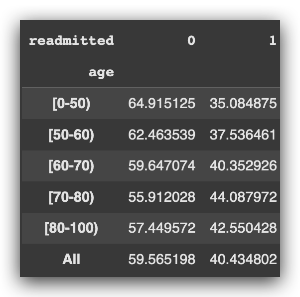
I now have a data table for each age group, with 0 or 1 indicating whether the patient was readmitted, along with the percentage.
Important point: Data isn’t always ready to plug directly into a chart. You may need to do some pre-calculations, data preparation, or even table joins.
Once you have this data table, you can go ahead and create the chart.
# 11. Pandas Bar Chart

# Note that we call the plot from the DataFrame using Matplotlib in this case
fig = age_readmission_percentage.plot(kind='bar',
                                      figsize=(16, 7),
                                      width=0.5,
                                      edgecolor='g',
                                      color=['b', 'r'])

# Legend
plt.legend(title='Patient Readmitted', labels=('No', 'Yes'))

# x-axis label
plt.xlabel("\nAge Group", fontsize=14, color='black')

# y-axis label
plt.ylabel("Total Readmissions", fontsize=14, color='black')

# Title
plt.title("Percentage of Readmissions/Non-Readmissions of Patients by Age Group\n", fontsize=14)

# Adding total values as labels on each bar
for p in fig.patches:
    fig.annotate('{:.0f}'.format(p.get_height()),
                 (p.get_x() + 0.2, p.get_height()),
                 ha='center',
                 va='bottom',
                 fontsize=14,
                 color='black')

# Displaying the chart
plt.show()
For this item, I chose to use a bar chart directly from Pandas. But what’s the difference? Are there bar charts available in each library? Yes, exactly.
Previously, we created the barplot using Seaborn, which I show below:

Here, I took the DataFrame created above and called the plot method directly, specifying the chart type as a bar with kind='bar'.
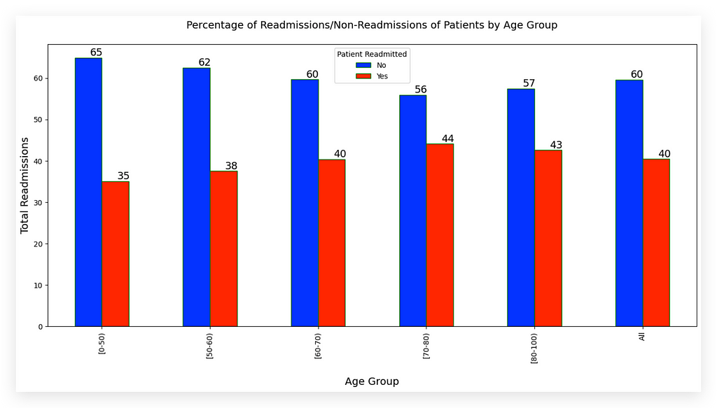
What’s the main difference? Seaborn and Matplotlib charts generally look a bit better and offer more customization.
But sometimes you don’t need that — if the chart is just for your quick reference, for example.
A fast way to create a bar chart is directly through Pandas. With the DataFrame ready, call the plot method, set kind='bar', and adjust parameters like figure size, width, edge color, and bar colors (in this case, B for blue and R for red). This quickly produces a bar chart.
Now, to set the legend, labels, and title, note a small detail: we use plt from Matplotlib, which we imported at the start of the notebook, as Pandas doesn't handle these beyond the basics.
# 11. Pandas Bar Chart

# Note that we call the plot from the DataFrame using Matplotlib in this case
fig = age_readmission_percentage.plot(kind='bar',
                                      figsize=(16, 7),
                                      width=0.5,
                                      edgecolor='g',
                                      color=['b', 'r'])
But you’ll need a legend, right? A title? And perhaps annotations for totals?
This is where Matplotlib becomes useful. In step #11, you use Pandas only to create the basic figure, and then handle all the formatting — like legend, title, and annotations — through Matplotlib.
# Legend
plt.legend(title='Patient Readmitted', labels=('No', 'Yes'))

# x-axis label
plt.xlabel("\nAge Group", fontsize=14, color='black')

# y-axis label
plt.ylabel("Total Readmissions", fontsize=14, color='black')

# Title
plt.title("Percentage of Readmissions/Non-Readmissions of Patients by Age Group\n", fontsize=14)

# Adding total values as labels on each bar
for p in fig.patches:
    fig.annotate('{:.0f}'.format(p.get_height()),
                 (p.get_x() + 0.2, p.get_height()),
                 ha='center',
                 va='bottom',
                 fontsize=14,
                 color='black')

# Displaying the chart
plt.show()
This approach lets you explore different ways to create the chart.
Now, let’s analyze the chart:

Patients aged 70–80 have the highest readmission percentage, while those aged 0–50 have the lowest. Why use a bar chart? To deliver information quickly and accurately — a bar chart is a reliable choice.
Totals are placed on each bar to eliminate any need for interpretation; if users need to interpret too much, the chart is likely ineffective.
The colors — blue for non-readmitted and red for readmitted — are purposeful. Blue represents non-readmissions, which indicates a successful treatment and a positive outcome for the hospital. Red, typically associated with warnings, highlights the problem area: patients who returned, signaling treatment issues.
If I switched these colors, it would confuse the audience, as blue aligns with the hospital’s expectations (non-readmission) while red marks the problem. This small color choice significantly impacts clarity, showing the importance of thoughtful color use in visuals.


In the chart on the left, color wasn’t needed to distinguish the bars.
However, in the chart on the right, color differentiation was essential to make it clear that these represent two distinct pieces of information.
There’s no fixed rule — common sense should guide these choices.
5- Total Readmissions of Patients by Gender, Age, and Admission
Now, we want to see the total patient readmissions by gender, age, and admission type.
How many variables do we have? Admission type, age, gender, and total readmissions — four variables in total.
Creating a chart with four variables is complex, and the risk of misinterpretation is high. The more variables, the more challenging it becomes to convey information clearly.
You need to carefully choose alternatives that make the information accessible to your audience. For this case, I selected the CatPlot.
Let’s examine the chart first.
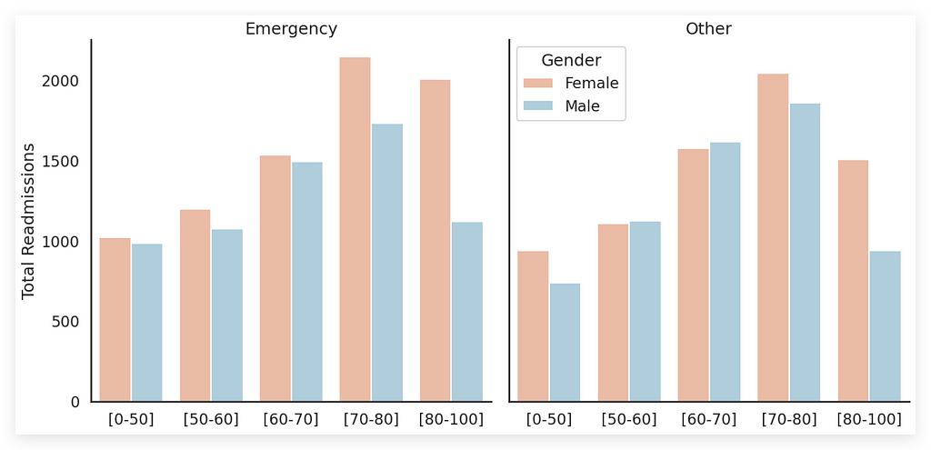
Notice that we have the four variables here, representing four dimensions:
- First, Gender (female and male), represented by bar colors. Colors were essential here, correct? Without colors, how would each bar be distinguished? Hence, using colors was necessary.
- Each chart — there are two — represents an Admission Type: emergency or other.
- Age Group is represented by the bars within each chart.
- Total Readmissions are displayed on the Y-axis as the height of each bar.
By looking directly at the plot, what do you observe? You’ll notice that there are far more readmissions for emergencies than for other types; the bars are slightly taller. You’ll also see that female readmissions are more frequent in emergency cases and somewhat lower for other types of admission. Furthermore, the 70–80 age group has the highest readmission rate, regardless of admission type.
Observe that I didn’t place totals above each bar. Why? Because it would clutter the chart. If you disagree, feel free to add the totals.
Always remember, however, that you’re creating a chart for people. The more cluttered the chart, the harder it is to read.
But, you might say, having totals is essential. The totals are here, just shown on the Y-axis. If you need exact information, what would I do? Add an auxiliary table with the totals for each bar.
This is because sometimes your audience only needs a general overview, not precise numbers. If exact totals are requested, simply provide a table alongside the chart to offer the necessary information.
Now, how did we create this type of chart?
# 12. Catplot (Category Plot with Bar Chart)

# Setting background
sns.set(style="white", context="talk")

# Creating the bar chart with catplot
# https://seaborn.pydata.org/generated/seaborn.catplot.html#seaborn.catplot
# https://seaborn.pydata.org/generated/seaborn.color_palette.html#seaborn.color_palette
g = sns.catplot(x='age',
                y='readmitted',
                hue='gender',
                col='admission_type_id',
                estimator=np.sum,
                data=data,
                palette="RdBu",
                kind="bar",
                height=7,
                aspect=1,
                legend=False,
                ci=None)

# Labels
(g.set_axis_labels("", "Total Readmissions")
 .set_xticklabels(["[0-50]", "[50-60]", "[60-70]", "[70-80]", "[80-100]"])
 .set_titles("{col_name}"))

# Legend
plt.legend(title='Gender', loc='upper left', labels=['Female', 'Male'])

# Displaying the chart
plt.show(g)
First, I’ll set up the background. Using Seaborn to format the figure’s background is a solid strategy. After that, I’ll create the CatPlot.
I’ve included reference links for you, including the CatPlot documentation and color palette options.
Notice that we used soft colors here because, in this case, I didn’t want to highlight any critical or problematic information for the hospital — something I did in the previous chart, where blue and red were essential.
I could have even softened those colors a bit more if needed. Here, I opted for much softer colors, which are generally a safer choice as well.
So, we created the CatPlot and added the variables in this section:
# Creating the bar chart with catplot
g = sns.catplot(x='age',
                y='readmitted',
                hue='gender',
                col='admission_type_id',
                estimator=np.sum,
                data=data,
                palette="RdBu",
                kind="bar",
                height=7,
                aspect=1,
                legend=False,
                ci=None)
You can see each of these elements here, all including the sum total (estimator=np.sum) for aggregating the data.
We have the dataset, color palette, plot type, height, aspect ratio, legend, and even the interval setting. In case you noticed, the minimum interval sets a minimum distance between the bars.
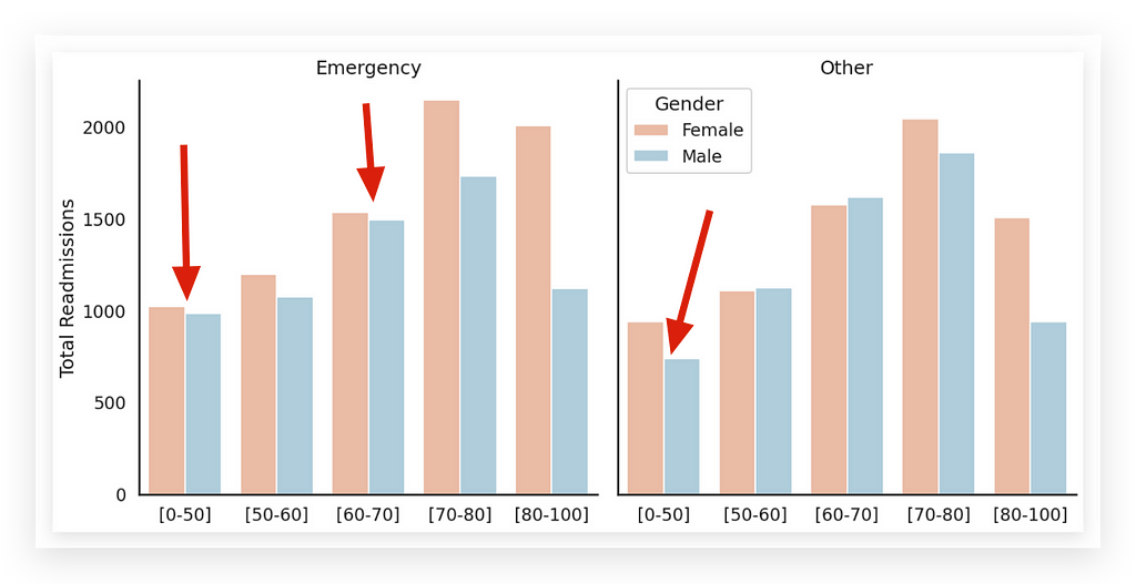
Why? To give the chart a more elegant look.
Notice that in the Pandas chart, the bars are close together:

It’s an option, and I’m showing you the possibility. If you want to give your chart a slightly more sophisticated tone, you can use this small detail — a slight spacing between the bars. This can greatly enhance visual clarity. After setting this up, we add the labels, legend, and display the chart.
# Labels
(g.set_axis_labels("", "Total Readmissions")
 .set_xticklabels(["[0-50]", "[50-60]", "[60-70]", "[70-80]", "[80-100]"])
 .set_titles("{col_name}"))

# Legend
plt.legend(title='Gender', loc='upper left', labels=['Female', 'Male'])

# Displaying the chart
plt.show(g)
We also built the labels for the X-axis, as this is not directly how it appears in the dataset.
However, this adjustment makes it much easier for you to analyze the age group.
The key here lies in formatting the necessary parameters for this chart.
6 . Total Readmissions/Non-Readmissions by Gender and Race
The next item addresses the total readmissions and non-readmissions, categorized by gender and race. How many variables do we have here? Three, correct? These include:
- Readmissions/Non-Readmissions,
- Gender,
- Race.
For this analysis, there are a few possible approaches. I chose to use the FacetGrid, and here it is.
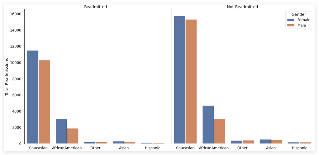
If you’re paying close attention, you might now be wondering, “Wait, isn’t this FacetGrid very similar to what we just did above?” Yes, both are FacetGrids.
A FacetGrid is simply a plotting area that allows you to display multiple charts within the same visual space. That’s the core concept of a FacetGrid.

Earlier, I created this object using the CatPlot. That’s all — just by calling CatPlot, it automatically generates a FacetGrid for you.
Here, however, I am not using CatPlot. Instead, I’m working with the FacetGrid directly. This distinction in terminology is important to clarify.
In terms of structure, both are FacetGrids — this one and the previous one. The difference lies in how they are created:
- The previous chart was built using CatPlot.
- Now, I’m creating the FacetGrid directly, combined with CountPlot to draw each bar.
This FacetGrid approach works best when dealing with three to five variables. If you're working with just two variables, a standard bar chart is typically the optimal choice, as shown earlier.
When handling 3, 4, or 5 variables within the same visualization, FacetGrid becomes a practical option.
It divides the plotting area into multiple bar charts, enabling you to display more information in a single figure.
To start, I created a copy of the DataFrame since certain data modifications were necessary.
# 13. Create a temporary DataFrame to adjust the target variable label for plotting
df_temp = data
The variable that indicates readmission contains values 0 or 1, presenting the same issue we discussed earlier.
# 14. Map 0 and 1 to labels
df_temp["readmitted"] = df_temp["readmitted"].map({0: "Not Readmitted", 1: "Readmitted"})
If I leave the values as 0 or 1, that's exactly how they'll appear on the chart: 0 or 1. Then, viewers will inevitably ask, "What does 0 mean? What about 1?"
To avoid this, let’s map the values:
- 0 becomes Not Readmitted
- 1 becomes Readmitted
I’ll modify the data in df_temp. Why? To keep the original DataFrame intact.
The original DataFrame might still be needed for other charts, where altering the variable might not be desirable.
So, what’s the strategy?
- Create a copy of the DataFrame.
- Modify the copy.
- Use the modified copy to create the chart.
# 15. First rows of the temporary DataFrame
df_temp.head()
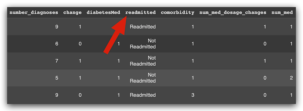
Observe the modified variable here, but only in the df_temp copy.
Now, let’s draw the FacetGrid. First, I will remove the background.
# 16. Facet Grid

# Removing the background
sns.set(style="white", context="talk")

# Create a function for countplot
def countplot(x, hue, **kwargs):
    sns.countplot(x=x, hue=hue, **kwargs)

# Create a facet grid (using the temporary DataFrame)
grid = sns.FacetGrid(data=df_temp, col='readmitted', height=10, aspect=1)

# Mapping the facet grid to variables
fig = grid.map(countplot, 'race', 'gender', palette='deep')

# Labels
(fig.set_axis_labels("", "Total Readmissions")
 .set_xticklabels(["Caucasian", "AfricanAmerican", "Other", "Asian", "Hispanic"])
 .set_titles('{col_name}'))

# Legend
plt.legend(title='Gender', loc='upper right', labels=['Female', 'Male'])

# Remove chart borders
sns.despine(bottom=True)
Since I defined this for the previous chart, I’m simply showing you how to clear the plotting area.
I’ll create a countplot that takes x as the variable, defines the fill parameter, and uses **kwargs to accept additional arguments if needed. After that, I'll create the countplot.
Next, I’ll call the FacetGrid to draw the entire area. In the FacetGrid, I'll specify the dataset and the column that determines the grid's division.
This column dictates how the FacetGrid is split—creating one area for the Readmitted category and another for the Not Readmitted category.
I’ll then set the height and aspect ratio to adjust the chart’s format. After that, I’ll map the FacetGrid to the variables by applying the countplot for each variable, generating bar charts in each section based on their category.
An important note: you can create this type of chart in Power BI, but it requires some extra work. You’ll need to merge and adjust variables.
While Power BI offers fewer customization options, Python provides significant flexibility for tailoring these visualizations.
Once the mapping is complete, I’ll add labels, a legend, and here we have the final result.

Caucasian women form the majority among readmitted females. On one side, we see Readmitted, and on the other, Not Readmitted.
The color blue represents female gender, while orange represents male gender.
When analyzing the Readmitted category, which is generally the focus of hospital staff, what stands out as the tallest bar? It’s the blue bar, representing Caucasian women.
This provides a quick analysis, with the total readmissions shown on the Y-axis and the X-axis displaying the names of the races as represented in the column.
Tip: Whenever you need to create a chart with 3, 4, or 5 pieces of information, FacetGrid is an excellent option and a powerful data visualization technique.
7. Number of Visits x Comorbidity
So far, I’ve focused heavily on what you should do.
Now, I’ll also highlight what you shouldn’t do, or at least what you should avoid whenever possible.
Let’s dive into analyzing the number of visits versus comorbidity. Remember, this project builds on the previous chapter.
If you missed it or skipped it, you’ll likely face difficulties understanding this section. I recommend going back, reading it carefully, and then continuing here.
The first step is to create a contingency table using Crosstab. This will allow us to cross-reference the data effectively.
# 17. Create the contingency table
num_visits_comorbidity = pd.crosstab(data.number_inpatient, data.comorbidity).sum()
num_visits_comorbidity
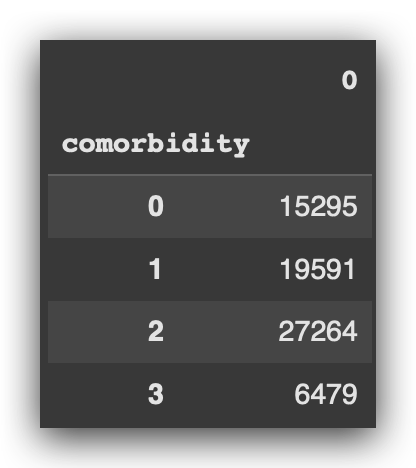
Here, we have the total, representing the number of visits for each level of comorbidity.
You might recall that we prepared the comorbidity variable during the feature engineering phase in the previous project.
Now, I’ve simply calculated the contingency table to obtain the total number of visits for each comorbidity category.
With this, the data is ready and stored in a Pandas Series format.
# 18. Type
type(num_visits_comorbidity)

Now, I’ll plot the data using an area chart.
However, as I noted in the code: avoid this type of chart.
And why should you avoid it? Take a close look at the chart.
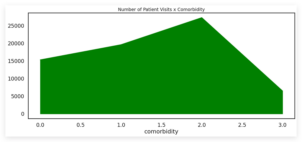
Is this chart easy to interpret? Does it clearly convey information? The answer is no.
It’s not a trivial chart — you can’t just glance at it and extract meaningful insights.
Here’s what we see:
- Peaks and valleys that indicate comorbidity levels.
- The Y-axis represents the total.
But consider the line descending into a valley and then rising to a peak. What exactly does this line represent? What about the green area beneath it? These questions arise immediately when viewing the chart.
This lack of clarity makes the chart difficult to interpret.
While it’s not the worst type of chart, it’s far from being an effective one. The issue isn’t with creating the chart — that’s straightforward. The real problem lies in how complex and unclear it is for interpretation.
# 19. Area Chart (avoid using this!)

# https://pandas.pydata.org/pandas-docs/stable/reference/api/pandas.Series.plot.html
fig = num_visits_comorbidity.plot(kind='area',
                                  figsize=(15,6),
                                  color='Green')

# Adding total values as labels on each bar
for p in fig.patches:
    fig.annotate('{:.0f}'.format(p.get_height()),
                 (p.get_x() + 0.2, p.get_height()),
                 ha='center',
                 va='bottom',
                 fontsize=14,
                 color='black')

# Title
plt.title("Number of Patient Visits x Comorbidity", fontsize=14)
plt.show()
I call my DataFrame, use the plot function, specify the chart type as area, set the figure size, and choose the color. The rest is just formatting.
However, any adjustments you attempt here — such as adding labels or totals — will hardly make a difference.
If you remove the fill and leave only the line, it works better as a line chart, which is ideal for showing something over time.
But that’s not the case here. All we need is the total by comorbidity, nothing more.
An area chart is not the ideal choice in this situation, and I’m demonstrating why.
Now, I can already anticipate your question: If the area chart isn’t ideal, then what is the best chart?
You already know the answer, don’t you? The bar chart.
Isn’t this bar chart much better?
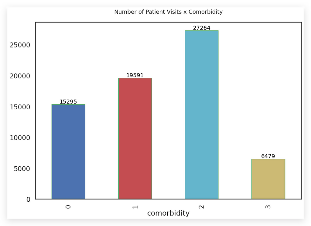
Tell me, which chart delivers the information better? Both charts provide the same data, but which one communicates it more effectively?
There’s no debate here — the bar chart is clearly better.
- The size of each bar represents the information for each comorbidity.
- The total is shown on top of each bar.
- The chart has a clean white background, making it easy to analyze.
- The colors are soft and subtle, with each one representing a specific type of comorbidity.
These colors enhance the information being conveyed, complementing the bar sizes.
Although the bar chart transmits the same information as the area chart, it is a safer choice in most scenarios.
If you need to present many charts, you might wonder:
“Should I only use bar charts? Won’t that limit me from showcasing different Python visualization techniques?”
The answer is no. Your job isn’t to create fancy charts; it’s to solve business problems.
If you can solve the problem with a bar chart, use it. In the vast majority of cases, it’s enough.
An area chart should only be considered for very specific cases. Even then, it requires significant customization and may still challenge the audience’s ability to interpret the data.
When in doubt, choose the bar chart — a reliable, effective solution.
# 20. Bar Chart (always a safer option)

# Remove background lines
sns.set(style="white", context="talk")

# Create the bar chart
fig = num_visits_comorbidity.plot(kind='bar',
                                  figsize=(12,8),
                                  width=0.5,
                                  edgecolor='g',
                                  color=['b','r','c','y'],
                                  rot=90)

# Adding total values as labels on each bar
for p in fig.patches:
    fig.annotate('{:.0f}'.format(p.get_height()),
                 (p.get_x() + 0.25, p.get_height()),
                 ha='center',
                 va='bottom',
                 fontsize=14,
                 color='black')

# Title
plt.title("Number of Patient Visits x Comorbidity\n", fontsize=14)

# Displaying the chart
plt.show()
The creation of this chart followed almost the same process as the previous one.
- Once again, we used the plot function from the DataFrame.
- I specified the bar chart, set the figure size, and defined the width.
- The edgecolor parameter (G) sets the outline color, which in this case is green.
Next, I assigned a different color to each bar:
- blue, red, cyan (light blue), and yellow.
After that, I adjusted the rotation of the labels to 90 degrees, making the comorbidity labels easier to read.
This demonstrates that such customizations are possible. Finally, I added annotations and completed the bar chart.
It conveys the information far better than the area chart.
8. Proportion of Readmissions by Number of Visits Before Discharge
Now, we aim to calculate the proportion of readmissions based on the number of visits before discharge.
To do this, we’ll create a contingency table, as we need to work with proportions and percentages.
# 21. Contingency table
percent_visits_readm = pd.crosstab(data.number_inpatient, data.readmitted, normalize='index') * 100
percent_visits_readm
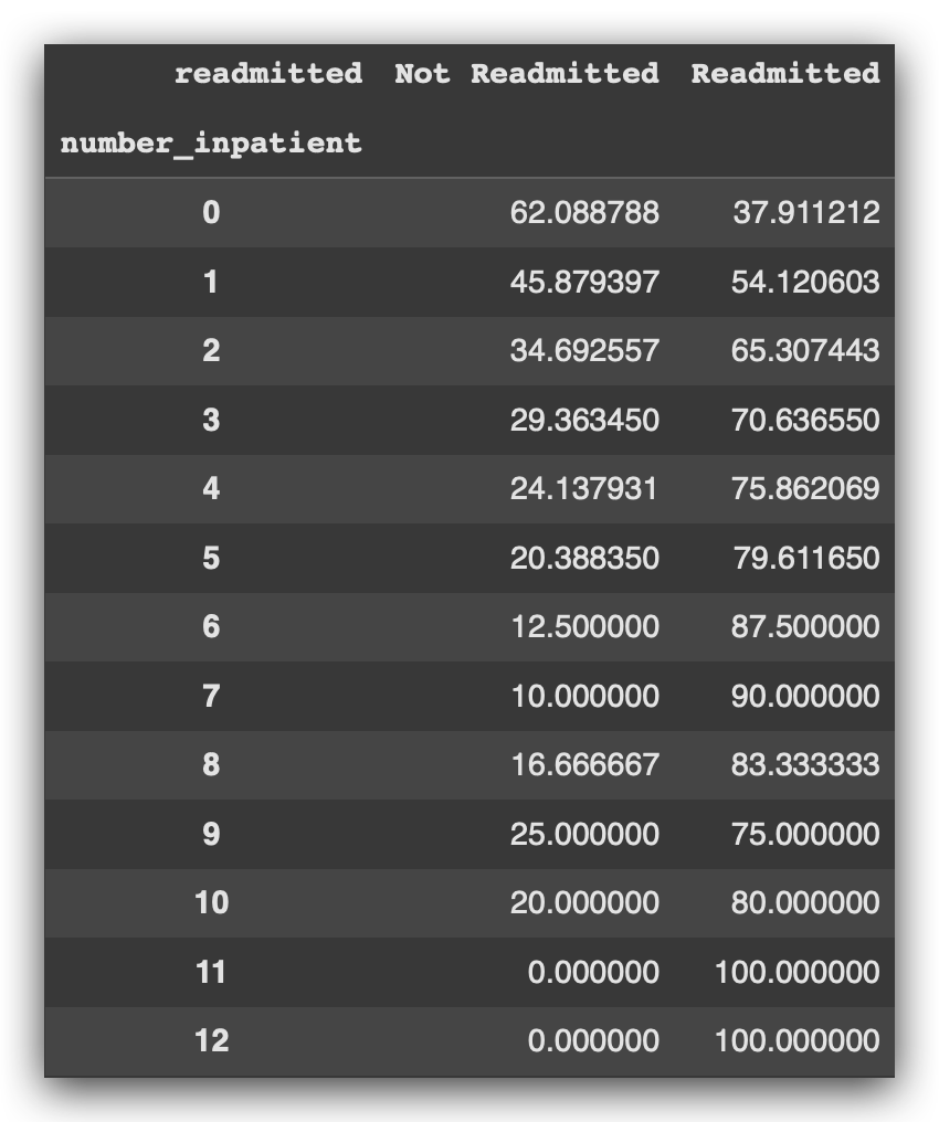
This process is very similar to one of the previous steps.
First, you need to prepare the data, convert it into percentages, and only then proceed to create the chart.
Since we’ve already calculated the contingency table, which results in a Pandas DataFrame, why not directly use it to create the chart?
# 22. Pandas Bar Chart from Contingency Table

# Create the bar chart
fig = percent_visits_readm.plot(kind='bar',
                                figsize=(18,10),
                                width=0.5,
                                edgecolor='g',
                                color=['b','r'])

# Adding total values as labels on each bar
for p in fig.patches:
    fig.annotate('{:.0f}'.format(p.get_height()),
                 (p.get_x() + 0.1, p.get_height()),
                 ha='center',
                 va='bottom',
                 fontsize=14,
                 color='black')

# Title
plt.title("Proportion of Readmissions by Number of Visits Before Discharge", fontsize=15)

# Legend
fig.legend(title='Patient Readmitted', labels=('No', 'Yes'))

# Displaying the chart
plt.show()
Specify the chart type, figure size, bar width, the edge color for the bars, and the bar colors.
In this case, I used blue and red for the bars.
Add the annotations, title, and legend, and there you have it: the completed chart.
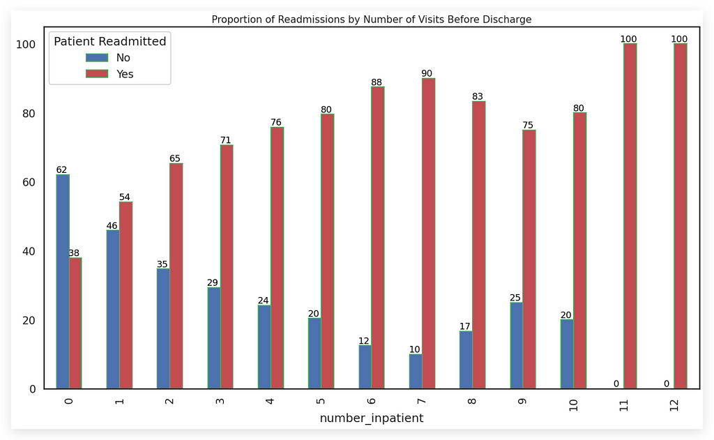
Notice that we have several bars here. Earlier, I mentioned that when dealing with many bars, it might not be ideal to place the total on top of each bar. Remember that?
In this case, although there are many bars, they are thin and narrow, which makes adding totals feasible. This small detail makes a big difference, doesn’t it?
Even though the totals are displayed, they don’t interfere with the visual clarity because:
- The totals are relatively small, typically dozens or perhaps hundreds, and
- The narrow width of the bars accommodates these totals without cluttering the chart.
Now, imagine if the bars were wide, or if the totals were in thousands or monetary values — this would overcrowd the chart and make it look messy.
So, when working with many bars or even a reasonable number of bars, make them narrow, and you can add totals if they fit neatly at the top.
We define the bar width using this parameter:
width=0.5
This value ensures the bars remain narrow enough to allow totals to be displayed clearly at the top.
# Create the bar chart
fig = percent_visits_readm.plot(kind='bar',
                                figsize=(18,10),
                                width=0.5,   # <---------
                                edgecolor='g',
                                color=['b','r'])
You can see that blue represents No (not readmitted), while red represents Yes (readmitted), which is the key issue we want to highlight — this is the main focus for the hospital, our business area, and our client.
An important point to note is consistency. If you use red to represent the Yes category (readmission), maintain this choice across all charts in your presentation, report, or conclusion.
Do not mix colors — this is simply good practice and common sense. Once you choose red for the Yes category (readmission), stick with it in all visualizations.
Finally, the conclusion is clear: the more visits a patient has before discharge, the higher the volume of readmissions. In other words, frequent visits (or consultations) correlate with increased chances of readmission, and the chart effectively demonstrates this.
9. What is the Frequency of the Number of Medications Consumed?
This is one of the most well-known statistical charts: the histogram.
Whenever you see the term frequency, the histogram is likely the appropriate choice.
So, what is the frequency of the number of medications consumed?
To answer this, I’ll create a figure and use the distplot function from Seaborn, which is designed for building histograms.
# 23. Histogram (Dist Plot)

# Figure size
plt.figure(figsize=(12,6))

# Create the plot
sns.distplot(data['num_medications'],
             hist=True,
             color='Blue',
             axlabel="Number of Medications Consumed")
I specify that I want to use the num_medications data, set hist=True to enable the histogram, choose the color, and define the label for the X-axis.
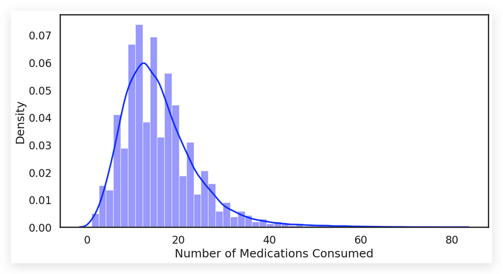
Notice that in this chart, the distplot generates a strong blue line, representing the density plot. The bars visible in the background are the histogram, as I set hist=True.
In practice, the distplot is essentially a density plot, which visualizes the distribution. Could we use just the line? Yes, but the histogram bars provide additional information.
The X-axis represents the number of medications, while the Y-axis shows the density.
What do we observe? Medications ranging from 5 to 20 are the most frequent and intense. The histogram becomes an excellent choice when visualizing the frequency of a variable.
Additionally, you’ll notice that more than 40 medications is extremely rare, with most patients consuming between 5 and 10 medications.
I also included an example of a stacked histogram, but I strongly recommend avoiding it whenever possible.
# 24. Two histograms for two variables in the same plot (avoid using this!)
data[["num_medications", "number_diagnoses"]].plot(bins=30, kind="hist", figsize=(8,6))
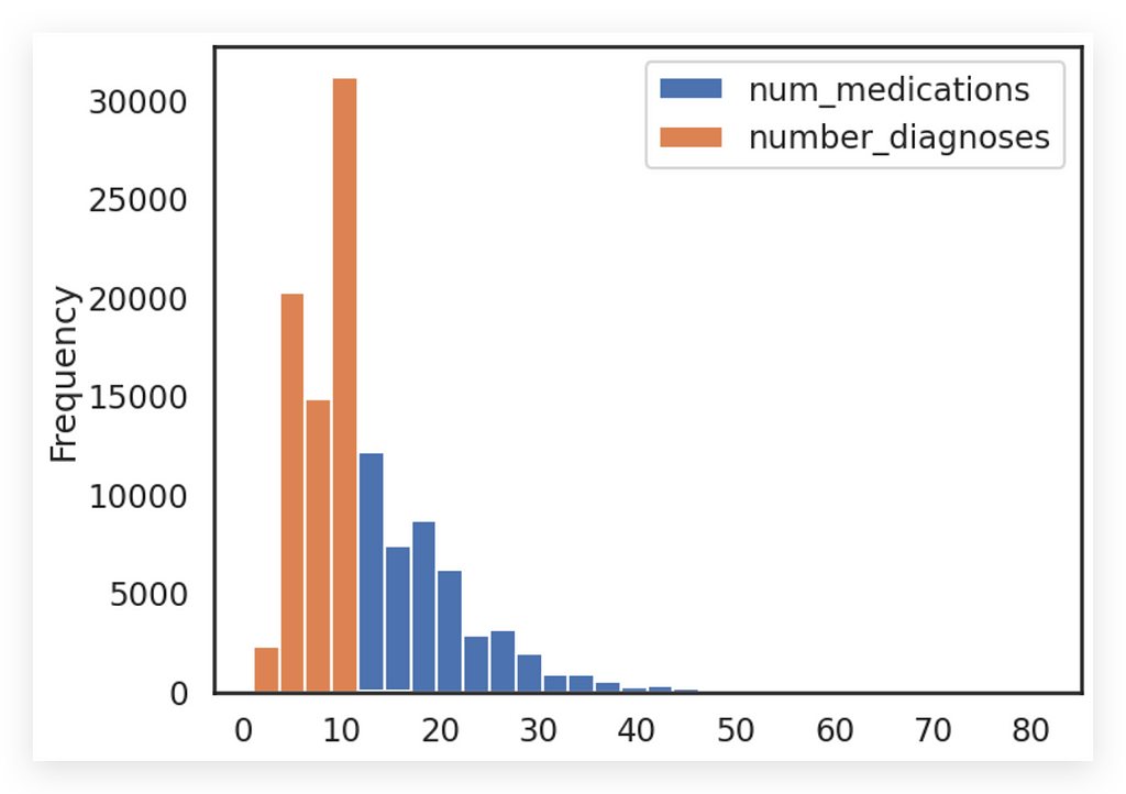
In this chart, we have two histograms for two variables displayed in the same plot, distinguished by colors.
Do I recommend this? No. I’m showing this example primarily as a didactic exercise to highlight what not to do.
Is it technically feasible? Yes. In this case, I used the num_medications and number_diagnoses variables from the DataFrame, called the plot function, specified the number of bins, the type, and the figure size. There’s no technical difficulty in creating such a chart.
However, this approach results in a poor visualization because mixing two variables in a histogram usually leads to confusion.
Why? You’re not comparing the same type of data.
- For instance, the orange line represents the number of diagnoses, and
- You cannot meaningfully compare this frequency to the number of medications.
This makes it difficult to draw any direct association between the two.
The only clear takeaway is that the blue bars (medications) have a lower frequency than the orange bars (diagnoses). But this isn’t an effective way to compare two distinct variables.
I’m not saying this should never be used because I can’t account for all possible scenarios. If it exists in Pandas, it’s because the developers deemed it useful in specific cases.
However, I wouldn’t recommend using a stacked histogram like this. Instead, I prefer this alternative: creating separate histograms.
# 25. This can be a good option
data[["num_medications"]].hist(by=data.readmitted, figsize=(10,5), color='Red')
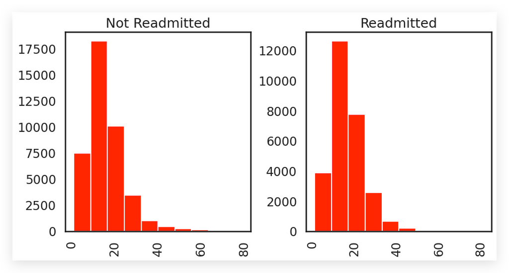
A better approach is to create one histogram per variable, using, for example, each class. I prefer to separate the variables and separate the classes, as this provides clearer information, reduces ambiguity, and makes it easier for your audience to interpret.
In this example, the same variable is split into two distinct categories. I could use this strategy to create:
- A histogram for the first variable (orange), and
- Another histogram for the second variable (blue).
This would result in completely separate histograms, which is the ideal approach.
While I’ve shown you that a stacked histogram is technically possible, I advise against using it.
If you find it necessary to display two histograms, draw them independently. This significantly simplifies the analysis process.
10. Patient Behavior by Clinical Procedures
To conclude this work, here’s one more example of what not to do.
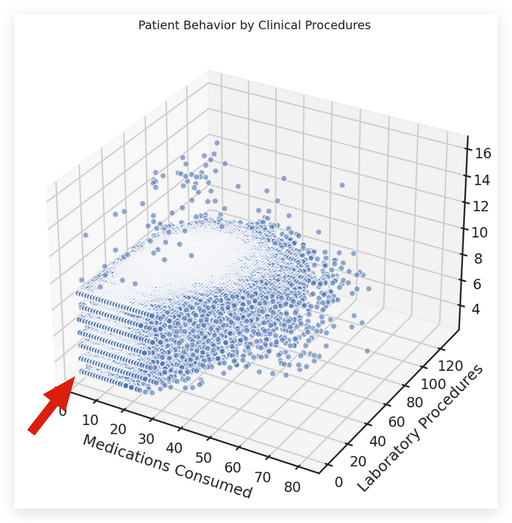
Do not create this type of chart:
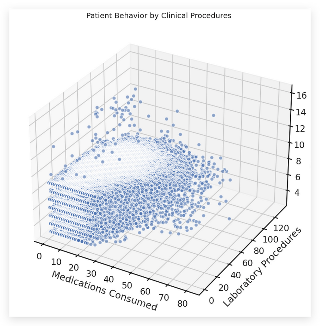
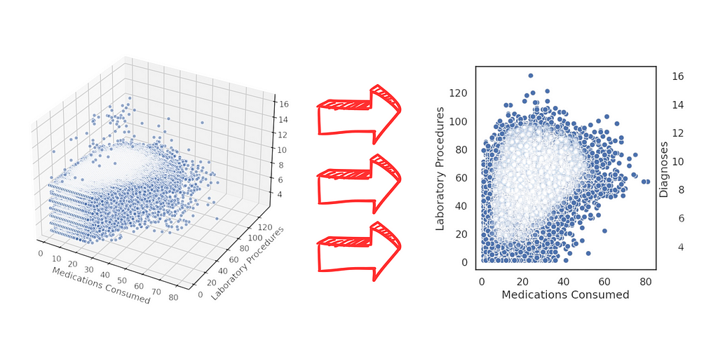
3D charts should only be used as a last resort.
These charts are undeniably attention-grabbing — if you want to attract attention, a 3D chart can serve that purpose. However, they’re only good for that: grabbing attention.
In terms of information delivery, 3D charts are inherently poor choices.
Consider the example:
We aim to analyze patient behavior through clinical procedures.
- The data includes the number of medications, laboratory procedures, and diagnoses.
- These are plotted in three dimensions: X, Y, and Z.
While visually impressive, 3D charts fail to convey information effectively and often make interpretation unnecessarily complicated.
# 26. 3D Projection (AVOID THIS!!!!!)

# Figure size
fig = plt.figure(figsize=(14, 10))

# Subplots
ax = fig.add_subplot(111, projection='3d')

# Dimensions
xs = data['num_medications']
ys = data['num_lab_procedures']
zs = data['number_diagnoses']

# Scatter plot
ax.scatter(xs, ys, zs, s=50, alpha=0.6, edgecolors='w')

# Labels
ax.set_xlabel('\nMedications Consumed')
ax.set_ylabel('\nLaboratory Procedures')
ax.set_zlabel('\nDiagnoses')

# Title
plt.title("Patient Behavior by Clinical Procedures", fontsize=14)

# Displaying the chart
plt.show()
Here, I created the figure and added subplots with a 3D projection.
Technically, creating a 3D chart isn’t difficult:
- I added the scatter plots, which are essentially a collection of inspection charts combined in a 3D space.
- You define the scatter, specify the X, Y, and Z values, customize the area, set the labels, and the chart is done.
However, it’s still a bad chart.
Why?
- Any interpretation becomes unnecessarily challenging.
- Even as an attention-grabbing tool, it fails — it’s simply too confusing for the audience.
Instead of solving problems, this chart gives the impression that you’re showcasing programming skills rather than focusing on the business issue at hand.
Your job isn’t to create visually complex charts; it’s to solve business problems.
Instead of this, use a better alternative, like the one I’ll show you next.
 27. 2D Plot (USE THIS!!!!)

# Creating 2D plots
fig, axs = plt.subplots(1, 3, figsize=(18, 6))

# Plot of Medications Consumed vs. Laboratory Procedures
sns.scatterplot(x=data['num_medications'], y=data['num_lab_procedures'], data=data, ax=axs[0])
axs[0].set_xlabel('Medications Consumed')
axs[0].set_ylabel('Laboratory Procedures')

# Plot of Medications Consumed vs. Diagnoses
sns.scatterplot(x=data['num_medications'], y=data['number_diagnoses'], data=data, ax=axs[1])
axs[1].set_xlabel('Medications Consumed')
axs[1].set_ylabel('Diagnoses')

# Plot of Laboratory Procedures vs. Diagnoses
sns.scatterplot(x=data['num_lab_procedures'], y=data['number_diagnoses'], data=data, ax=axs[2])
axs[2].set_xlabel('Laboratory Procedures')
axs[2].set_ylabel('Diagnoses')

# Title
plt.suptitle("Patient Behavior by Clinical Procedures", fontsize=16)

# Displaying the plots
plt.show()
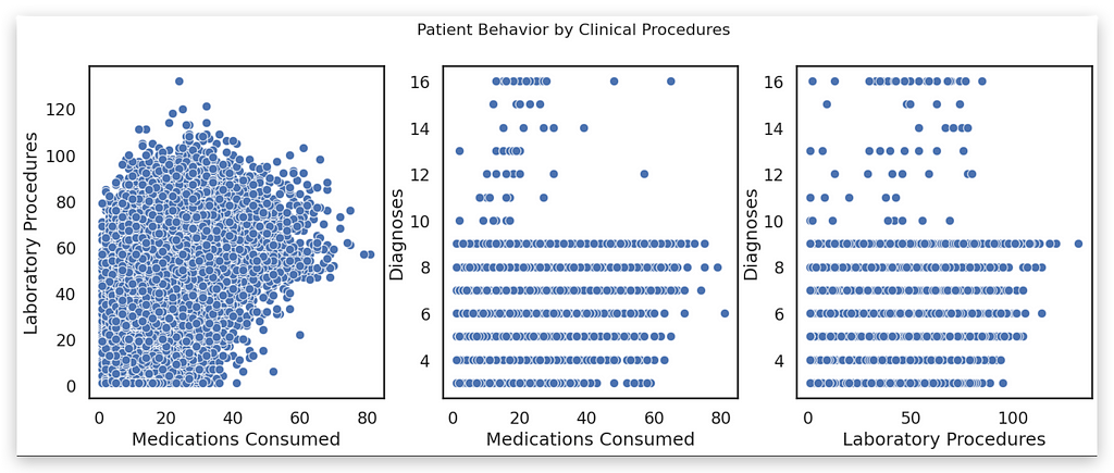
Didn’t I just say that a 3D chart is essentially a collection of scatter plots?
Instead, we can create scatter plots — 2D binary charts — and combine the variable pairs. These are much easier to analyze.
In fact, there’s no comparison:
- For example, you can immediately observe a positive relationship between num_lab_procedures and num_medications.
- However, there’s no clear relationship between number_diagnoses and num_medications, nor between number_diagnoses and num_lab_procedures.
Done. In seconds, we’ve drawn conclusions. Meanwhile, we’re still struggling to interpret anything meaningful from that 3D chart!
And in just moments, we’ve drawn conclusions from these three scatter plots.
There’s no comparison — this is clearly a much better option.
You should avoid 3D charts, even though they’re available. I’m not saying they’re impossible to use or that you should never use them. The word never is too strong. Instead, I say: avoid.
Only use 3D charts if they are absolutely necessary to convey a specific type of information.
In this case, for example, a 3D chart is clearly unnecessary.
In terms of interpretation, notice how the points in the scatter plot cluster closely around the intersection of medications consumed and laboratory procedures.
This makes interpretation easier because we’ve already seen the scatter plot below. So why would I complicate things for my audience with a 3D chart?
It doesn’t make sense. Instead, use scatter plots to show pairwise relationships. This approach is far superior to attempting a 3D visualization.
Delivering the Analysis Results
We have completed another project in which we created a wide variety of charts: charts to use and charts to avoid.
I provided a series of tips on how to build effective visualizations. None of this is particularly unusual — you don’t need flashy or overly complex visuals. The techniques presented here will cover more than 95% of your data visualization needs.
What matters are the details:
- Bar sizes
- Colors
- Labels
- Totals
These small adjustments have a far greater impact than relying on fancy visuals or other unnecessary elements.
Additionally, I shared an important principle: a well-designed chart is one that requires no interpretation.
I’m not saying it’s easy, but striving to create charts that convey information directly is the goal.
- Sometimes, you won’t have enough time due to project deadlines.
- Other times, you might not yet fully understand the tools.
Still, aim to create charts that minimize interpretation.
This allows you to deliver results to your audience or decision-makers — charts they can use to truly analyze the data. That’s the purpose of creating charts, isn’t it? To help decision-makers look at information, develop strategies, make daily decisions, and understand the behavior of variables.
If needed, you can now modify the code to save each chart as an image. Use the plt.savefig function.
Check out the Matplotlib documentation for details, and you’ll be able to save each figure as a PNG file. These images can be used later in presentations or documents.
You can summarize all your findings in a single Word document, include the images, and send it as a report to decision-makers.
And with that, we wrap up another project
Thank you very much. 🐼❤️
All images, content, and text are created by Leo Anello.
Data Visualization Techniques for Healthcare Data Analysis — Part III was originally published in Towards Data Science on Medium, where people are continuing the conversation by highlighting and responding to this story.
from Datascience in Towards Data Science on Medium https://ift.tt/Nh7LsSP
via IFTTT


