Statistical Analysis Using Python: Insights from Cancer Treatment Data
Step-by-step exploration of statistical methods, data visualization, and regression analysis
Overview
This project focuses on statistical analysis using Python, applying various techniques to uncover insights from a fictitious dataset inspired by real-world cancer treatment experiments.
While the dataset itself is simulated, the project draws inspiration from research standards such as McGill University’s Standard Operating Procedures, emphasizing both data accuracy and ethical experimental design.
The dataset represents a study involving 100 mice with squamous cell carcinoma (SCC), a type of skin cancer, treated with four different regimens. Over 45 days, tumor development was observed and recorded, providing a rich dataset for analysis.
This project is particularly intriguing because, even with fictitious data, it mirrors real-world applications and challenges. The goal is to show that once you master data analysis techniques, you can apply them to any dataset or field.
With access to the data dictionary and a clear understanding of the variables, you’ll have all the tools to explore the dataset. Step by step, I’ll guide you through creating a comprehensive statistical analysis report.
Let’s dive in and get started!
Table of Contents
- Tools and Setup: Python Libraries Used
- Dataset Overview: Data Dictionary & Structure and Variables
- Data Preparation: Cleaning Data & Handling Missing Values and Duplicates
- Statistical Analysis: Summary Statistics &Outlier Detection
- Exploratory Analysis
- Advanced Analysis: Medication Impact Over Time
- Results and Insights: Key Findings & Graphical Summaries
- Conclusion and Next Steps
Python Packages Used in the Project
We’ll begin this project, one I truly enjoy, by creating a statistical analysis report for data derived from experiments on mice treated with cancer medications.
Once you master these techniques, you can apply them in any field. All you need is the raw material — data, which can come from virtually any business sector or company.
Let’s start with the Python packages. First, we’ll use Watermark to generate a watermark:
!pip install -q -U watermark
And everything I need to create a statistical analysis platform in Python includes the following packages:
- NumPy: For numerical computing.
- Pandas: For data manipulation and analysis.
- Matplotlib: For data visualization.
- SciPy: For statistical functions and tests.
These packages together provide all the essential tools for the project.
# 1. Import necessary Python libraries for the project

# Numerical computing
import numpy as np

# Data manipulation and analysis
import pandas as pd

# Data visualization
import matplotlib.pyplot as plt

# Statistical functions and tests
import scipy.stats as st

# Warning control
import warnings

# Suppress warnings for cleaner output
warnings.filterwarnings('ignore')
These four packages will provide everything we need.
Are there additional Python packages for statistical analysis? Yes, there are many others. A notable example is StatsModels.
However, for most statistical analyses, these four packages are sufficient:
- NumPy and Pandas for data manipulation and statistical metrics calculation.
- Matplotlib for creating visualizations.
For more advanced analyses, we can utilize the Stats module within SciPy, Python's scientific computing package.
%reload_ext watermark
%watermark -a "panData"
Let’s load the packages, and then activate the Watermark package.
After that, read the manual with the data dictionary to familiarize yourself with the dataset structure.
Data Dictionary
This dataset was based on the study found at the link below:
The dataset contains records from a clinical experiment involving mice to test the efficacy of different drugs in treating or controlling tumor growth.
Each row represents an observation or measurement of a mouse at a specific time point during the study. Below is a detailed description of each column:
- mouse_id: A unique identifier for each mouse in the study. For example, "m000" and "m001" represent individual mice.
- drug: The name of the drug administered to the mouse. This field indicates the specific treatment given at each measurement point, such as "Placebo," "Ramicane," "Capomulin," and "Infubinol."
- sex: The sex of the mouse, indicated as "Male" or "Female."
- age_months: The age of the mouse at the start of the study, expressed in months.
- weight_g: The weight of the mouse, measured in grams.
- timepoint: A specific time point during the study when the measurement was taken, usually measured in days. This tracks the progression of the drug's effect over time.
- tumor_volume_mm3: The tumor volume in the mouse, measured in cubic millimeters. This is a key metric used to assess the drug's effectiveness in controlling tumor growth.
- metastatic_sites: The number of metastatic sites observed in the mouse at the time of measurement. Metastatic sites are locations where the original cancer spread to other parts of the body, indicating the severity or aggressiveness of the cancer.
Loading the Pharmaceutical Data
Let’s load and understand the dataset. Here, we have the CSV file containing the data:
# 2. Load the dataset into a DataFrame
df = pd.read_csv("dataset_.csv")
Next, we define the shape of the dataset to understand its structure:
# 3. Display the shape of the dataset (number of rows and columns)
df.shape

# (500, 8)
The dataset contains 500 rows and 8 columns.
# 4. Display the first 5 rows of the dataset for an overview
df.head()

So, we have multiple rows representing experiments conducted on mice.
- mouse_id is the identification code for each mouse, used to track their treatment with cancer medications—common practice in the pharmaceutical industry. For instance, m000 is one of the mice, among many others.
- Each mouse received specific medications at various timepoints. For example, mouse m000 was given Placebo at timepoint 0, Ramicane at timepoint 5, and the same medication again at timepoint 10.
The dataset includes key measurements such as:
- Tumor volume (tumor_volume_mm3), which reflects the treatment’s effectiveness.
- Weight (weight_g), age (age_months), and metastatic sites (metastatic_sites), which indicate the progression and spread of cancer cells.
It’s important to spend time understanding the variables and the dataset structure before proceeding with analyses.
The focus of this project is to evaluate the statistical impact of the drugs. Are there significant differences in tumor progression or other factors, such as mouse weight?
Next, let’s explore the medications in more detail.
Types of Medications
Let’s examine the medications administered to the mice for cancer treatment research.
These medications fall into three groups, with four distinct values in the drug column:
- Placebo: A control substance with no therapeutic effect, used to establish a baseline for comparing medication effects.
- Ramicane and Capomulin: Active drugs used to treat or control tumor growth by inhibiting cancer cells or reducing inflammation.
- Infubinol: A medication tested for its ability to prevent or reduce tumor growth and evaluate side effects.
Now, the focus is to verify — through statistical reports — how these medications behave in cancer treatment. This analysis is not about guesswork but grounded in statistical evidence.
The conclusions drawn will be valuable for decision-makers, researchers, scientists, and professionals in the pharmaceutical field.
Let’s start by summarizing the dataset.
# 5. Display dataset summary: column names, data types, and non-null counts
df.info()
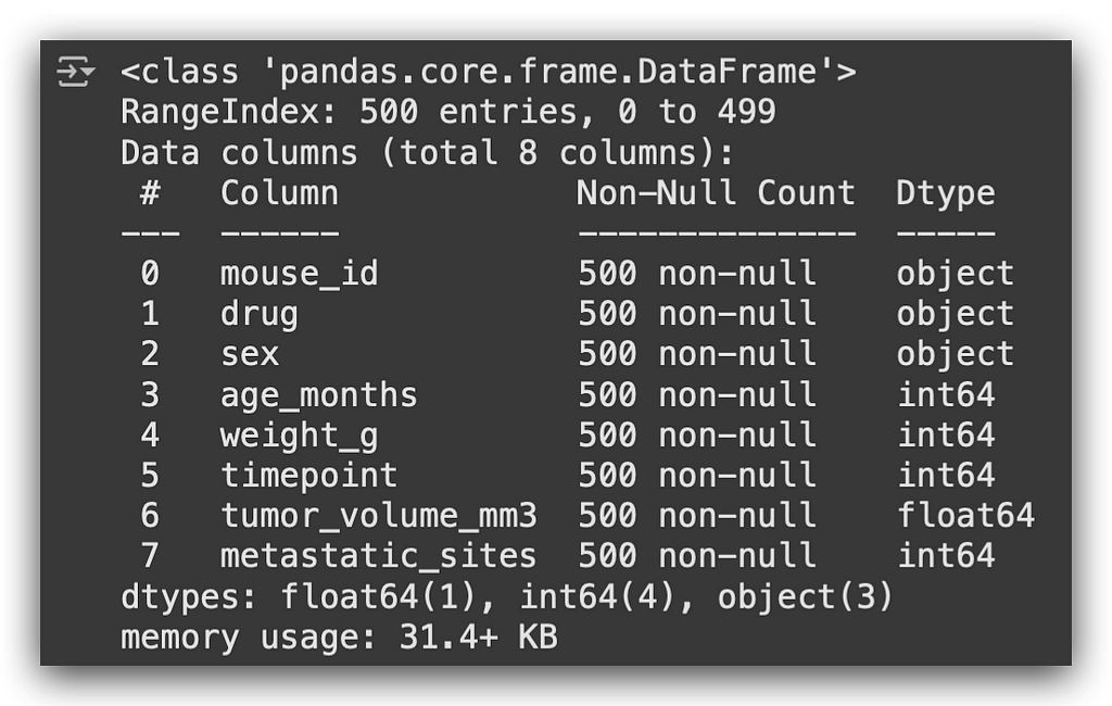
We have variables of type object, classified as strings, and numerical variables such as int or float64.
From here, we will proceed with:
- Data cleaning
- Statistical summaries
- Exploratory analysis
- Detecting outliers using statistical methods
- Creating quartiles and boxplots
This will be a comprehensive statistical analysis, covering each step in detail.
Initial Data Cleaning
The next step is initial data cleaning, starting with inspecting the column names:
# 6. Display column names to understand dataset structure
df.columns

Next, I’ll check the unique values for the mouse_id column:
# 7. Count unique mouse IDs to check for duplicates
df["mouse_id"].nunique()

# 100
We have 100 unique mice in the dataset. However, with 500 records, it suggests that each mouse received approximately 5 treatments.
Some mice might have had 4 treatments, while others 6, but there were 100 distinct subjects in total.
Now, let’s check for missing values:
# 8. Check for missing values in the dataset
df.isna().any()
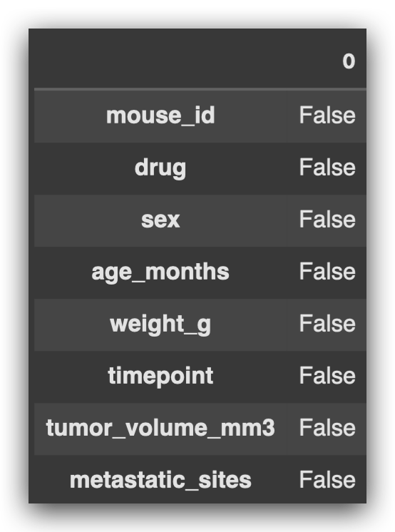
All values returned False, meaning there are no missing values in this dataset.
It may seem surprising, but missing values aren’t an issue here.
Next, let’s check for and extract any duplicates in the combination of mouse_id and timepoint:
# 9. Identify duplicates in the "mouse_id" and "timepoint" combination
duplicate_ID = df.loc[df.duplicated(subset=["mouse_id", "timepoint"]), "mouse_id"].unique()
This type of duplicate is problematic because it indicates that the same mouse received different treatments at the same timepoint.
To determine if this makes sense, it’s essential to check the data source and validate the rules.
For instance, let’s examine the first two records for clarification:

At timepoint 0, the mouse received one medication, and 5 days later, another.
However, we cannot have a repeated combination of mouse_id and timepoint, as this would imply the mouse received two treatments simultaneously, which isn’t valid for this experiment.
When discussing duplicates, it’s important to clarify:
- Are we checking duplicates for entire rows?
- Or for a specific column?
- Or for a combination of columns?
If duplicates exist, we’ll remove them based on the mouse_id and timepoint combination:
# 10. Remove rows with duplicate "mouse_id" and "timepoint" combinations, if any
df_final = df[~df["mouse_id"].isin(duplicate_ID)]
Next, we verify the shape of the dataset after removing duplicates:
# 11. Display the shape of the original dataset
df.shape

# (500, 8)
The shape remains unchanged, meaning there were no duplicates in the dataset.
This step emphasizes the importance of questioning the data at every stage:
- Does it make sense?
- Are such duplicates valid in this context?
Always verify with the data source or data dictionary, and base decisions on the defined rules. This ensures the analysis aligns with the experiment’s structure and logic.
Statistical Summary
Our first statistical report will be a summary. I’ll select two variables and apply a statistical summary to them.
First, let’s check the columns in the dataset:
# 13. Display column names of the cleaned dataset
df_final.columns

I’ll focus on two columns that are among the most relevant for this study:
- drug: The categorical column representing the medication administered.
- tumor_volume_mm3: The numerical column representing the tumor volume in cubic millimeters.
First, I’ll group the data by the drug column, then filter for the numerical column to calculate the statistics:
# 14. Group by "drug" and filter for the "tumor_volume_mm3" variable
df_final_grouped = df_final.groupby("drug")["tumor_volume_mm3"]
Notice the difference between parentheses and square brackets on the left.
- The groupby function uses parentheses to define the column to group by (in this case, drug).
- To filter for a specific column after grouping, square brackets are used (tumor_volume_mm3).
This results in an object, df_final_grouped, which contains only numerical values for tumor_volume_mm3. From this, we can calculate:
- Mean
- Median
- Variance
- Standard Deviation
- Standard Error of the Mean (SEM)
# 15. Calculate statistics for the "tumor_volume_mm3" variable
mean = df_final_grouped.mean()  # Mean
median = df_final_grouped.median()  # Median
variance = df_final_grouped.var()  # Variance
std_dev = df_final_grouped.std()  # Standard Deviation
sem = df_final_grouped.sem()  # Standard Error of the Mean
Here’s one approach, but let me show you a second one. I’ll compile all the calculations into a DataFrame using a Python dictionary.
In the dictionary:
- The keys will be the names of the statistics (e.g., Mean, Median).
- The values will be the calculations we’ve just performed.
# 16. Create a DataFrame to summarize statistical metrics
df_statistical_summary = pd.DataFrame({
    'Mean': mean,
    'Median': median,
    'Variance': variance,
    'Standard Deviation': std_dev,
    'SEM': sem
})

# 17. Display the statistical summary DataFrame
df_statistical_summary
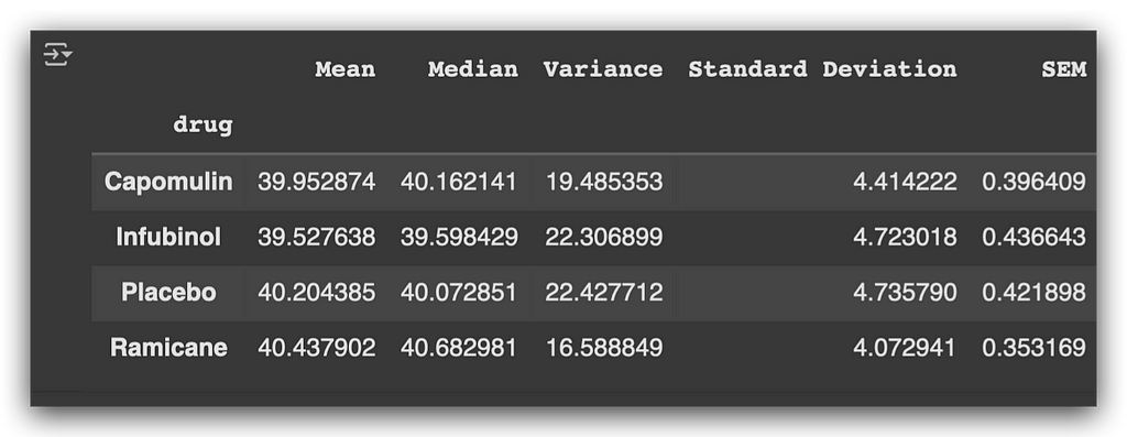
Now, for each medication, we have the mean, median, variance, standard deviation, and SEM based on the tumor volume.
Here’s what we observe:
- Placebo, a control substance with no therapeutic effect, shows a higher mean tumor volume compared to the other medications.
- Ramicane also exhibits a relatively higher mean tumor volume, though still lower than the placebo.
This provides initial insights into how each drug impacts tumor size.
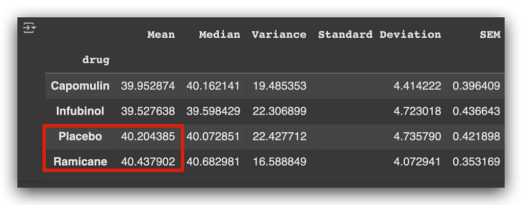
This suggests that the other two medications might be more effective at reducing tumor size.
Notice how the mean helps us draw this initial conclusion. However, the mean has a significant limitation:
- It is sensitive to outliers.
- A single extreme value can skew the mean.
To address this, we can also examine the median, which is less affected by outliers and provides a more robust measure of central tendency in such cases.
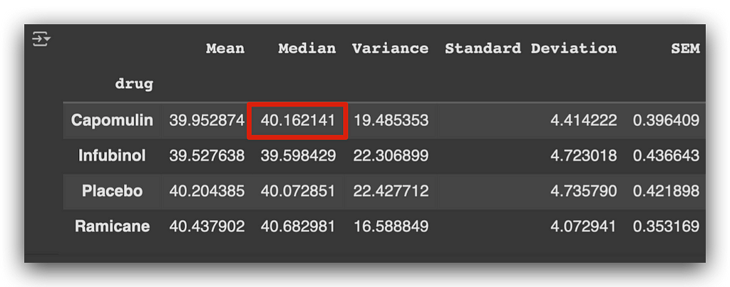
When analyzing the median, the first medication shows a higher median compared to the placebo and Ramicane.
It’s important to be cautious with these analyses. We’ll generate a statistical report for outliers shortly, but for now, let’s review the variance and standard deviation:
- These metrics indicate how spread out the data is.
- Ideally, smaller values suggest data points are closer to the mean.
- Larger values indicate greater dispersion, with longer tails in the distribution.
Additionally, the standard error (SEM) gives an idea of the precision of the mean.
This was one way to generate the statistical summary. Now, I’ll show you how to do the same with a single line of code:
# 18. Alternative approach for grouping and calculating statistics
aggregated_summary = df_final_grouped.agg(["mean", "median", "var", "std", "sem"])
The line above replaces the steps we executed previously across multiple code blocks:
# 14. Group by "drug" and filter for the "tumor_volume_mm3" variable
df_final_grouped = df_final.groupby("drug")["tumor_volume_mm3"]

# 15. Calculate statistics for the "tumor_volume_mm3" variable
mean = df_final_grouped.mean()  # Mean
median = df_final_grouped.median()  # Median
variance = df_final_grouped.var()  # Variance
std_dev = df_final_grouped.std()  # Standard Deviation
sem = df_final_grouped.sem()  # Standard Error of the Mean

# 16. Create a DataFrame to summarize statistical metrics
df_statistical_summary = pd.DataFrame({
    'Mean': mean,
    'Median': median,
    'Variance': variance,
    'Standard Deviation': std_dev,
    'SEM': sem
})
To recap:
- Grouping: Performed in step #14 with the groupby function.
- Statistics Calculation: Executed in step #15 (mean, median, variance, standard deviation, SEM).
- DataFrame Creation: Organized into a DataFrame in step #16.
All these steps can be replaced with the single aggregated summary line:
# 18. Alternative approach for grouping and calculating statistics
aggregated_summary = df_final_grouped.agg(["mean", "median", "var", "std", "sem"])

print(aggregated_summary)
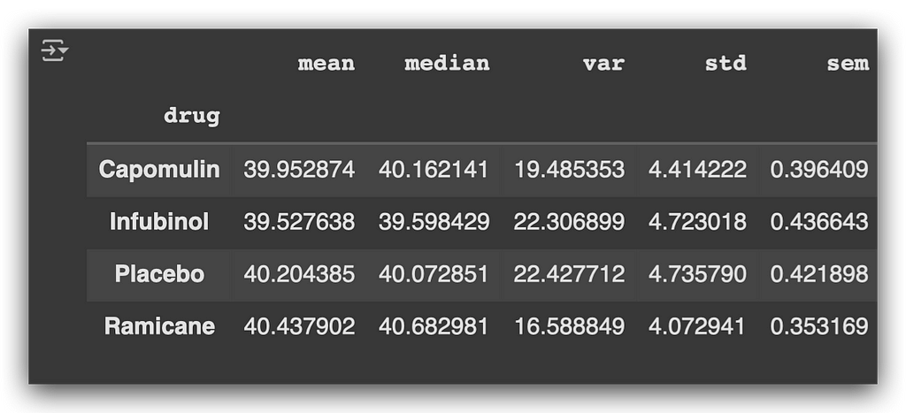
You can confirm that the numbers match exactly with the earlier calculations. Below is a description of each metric used:
- Mean: Calculates the arithmetic mean of the data.
- Median: Determines the middle value of the data.
- Variance (var): Measures dispersion, indicating how far the values deviate from the mean.
- Standard Deviation (std): The square root of the variance, showing how spread out the values are around the mean.
- Standard Error of the Mean (sem): Indicates the precision of the mean as an estimate of the population mean.
These are core statistics used to create summaries, applicable to almost any data analysis project you work on.
Exploratory Analysis
Another approach to creating a statistical report is through exploratory analysis, using graphs and visualizations.
First, let’s review the columns in the dataset:
# 19. Display column names of the cleaned dataset
df_final.columns

Next, I’ll calculate the count of records for each medication:
# 20. Count the number of records for each drug
df_final["drug"].value_counts()
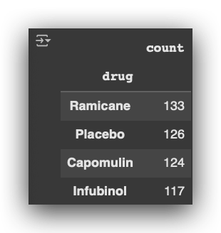
I’ll now create a chart to visualize this data.
First, I’ll define the figure size in step #21a. Then, using the value_counts extracted earlier, I’ll retrieve two elements in step #21b:
- The index, which represents the drug names.
- The values, which represent the record counts.
# 21. Plot the number of tests per drug

# 21a. Configure the figure size
plt.figure(figsize=(12, 5))

# 21b. Prepare x and y axes from the drug counts
x_axis = df_final["drug"].value_counts().index.values
y_axis = df_final["drug"].value_counts().values

# 21c. Create the bar chart
plt.bar(x_axis, y_axis, color="green")

# 21d. Add title and axis labels
plt.title("Number of Tests Per Drug")
plt.xlabel("Drug")
plt.ylabel("Number of Tests")

# 21e. Add grid for better readability
plt.grid(alpha=0.4)

# 21f. Rotate x-axis labels for better visualization
plt.xticks(rotation=45)

# 21g. Display the chart
plt.show()
I will create a bar chart, and the rest will involve formatting the chart.
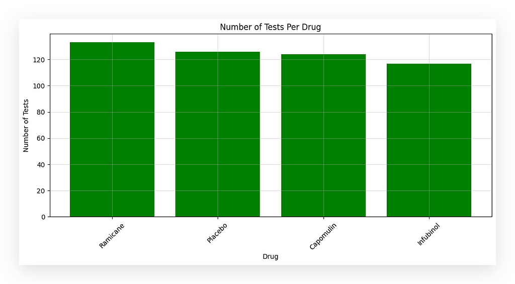
I am displaying the number of tests per medication. But how do we know each row represents a test? It’s all about data interpretation!
What does each row in the dataset represent? It represents a test conducted on a mouse to evaluate the effectiveness of a medication in treating cancer.
Thus, each row equals one test. When we count the rows, we obtain the total number of tests for each medication.
# 20. Count the number of records for each drug
df_final["drug"].value_counts()

The number of tests per medication is determined through data interpretation.
This is the essence of our work: interpreting, analyzing, and understanding the problem to generate conclusions that aid decision-makers.
Now, I want to check the average tumor volume by age group.
But wait — do we have age groups in the dataset?

No, we only have the age in months column.
To visualize by age group, I need to apply a transformation.
This involves creating bins, or ranges, to group the ages. For instance, I’ll divide them into six groups (bins) in step #22a:
# 22. Average Tumor Volume by Age Group

# 22a. Define age bins and labels
bins = [0, 6, 12, 18, 24, 30]
labels = ['0-6 months', '6-12 months', '12-18 months', '18-24 months', '24 months or more']

# 22b. Create age groups
df_final['age_group'] = pd.cut(df_final['age_months'],
                               bins=bins,
                               labels=labels,
                               right=False)

# 22c. Group by 'age_group' and calculate the mean tumor volume
avg_tumor_volume = df_final.groupby('age_group')['tumor_volume_mm3'].mean().reset_index()

# 22d. Import Seaborn and set up the plot figure size
import seaborn as sns
plt.figure(figsize=(12, 5))

# 22e. Create a bar plot of average tumor volume by age group
sns.barplot(x='age_group', y='tumor_volume_mm3', data=avg_tumor_volume)

# 22f. Add title and axis labels
plt.title('Average Tumor Volume by Age Group')
plt.xlabel('\nAge Group')
plt.ylabel('Average Tumor Volume (mm³)')

# 22g. Display the chart
plt.show()
I will create bins for the age groups: 0–6 months, 6–12 months, 12–18 months, 18–24 months, and 24 months or more.
You can adjust the number of bins depending on how you want to display the data.
To generate these age groups, in step #22b, use the cut function from Pandas. Specify the column to cut (age_months), define the bins (a Python list), and assign labels (another list).
Set the parameter right=False to exclude the right endpoint of each bin.
In step #22c, group the data by age_group, calculate the mean tumor volume, and reset the index.
Finally, in step #22d, plot the results in a bar chart. This process visualizes the average tumor volume across age groups, making it easier to interpret and compare the data.
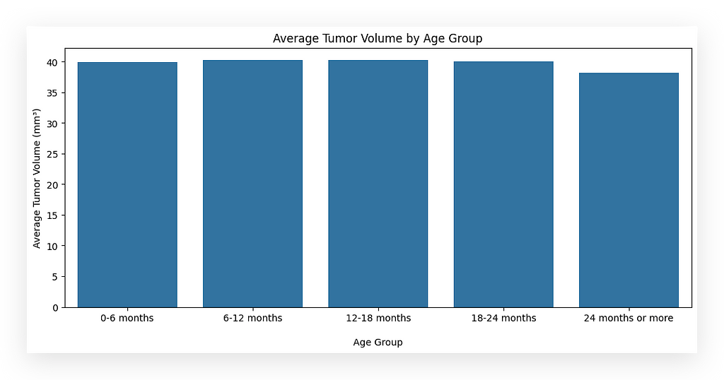
We didn’t have age groups explicitly in the dataset. Instead, this information is implicit.
Every dataset contains visible information, which is directly accessible, and invisible information, which exists but is not immediately apparent.
Age group is an example of invisible information — it’s there, but you need to process the data to uncover it.
This process involves identifying, treating, and transforming the data to generate the desired insights, such as charts or analyses.
All datasets behave this way. As you gain experience, you develop the ability to recognize invisible information.
While the visible data is obvious, the ability to extract invisible insights requires deeper knowledge, practice, and an exploratory approach, which is what I’m demonstrating here.
Quartiles, Outliers, and Boxplots
For the next statistical report, we’ll use quartiles, outliers, and boxplots. Detailed definitions are included in the notebook; you can refer to them later to complement these explanations.
What do quartiles tell us?
- Quartiles divide the data into four equal parts.
- Think of quartiles as bins where data points are grouped into four sections.
- By analyzing these sections, we can draw various conclusions.
Quartiles and Outliers
- Quartiles help identify outliers, which are data points that fall outside the typical range.
- The distribution of data based on quartiles can be visualized through boxplots.
Our Goal
We’ll now prepare a statistical summary focused on outliers using quartiles. Additionally, we’ll include a boxplot for better visualization.
Customizing the Boxplot
- A standard boxplot shows the quartiles, but it does not include the mean.
- I’ll demonstrate how to create a boxplot that displays the mean, ensuring clarity in your analysis.
Filtering and Organizing Data
To explain this as clearly as possible, I’ve already executed the steps. First, I’ll show you the desired result, and then we’ll go back and build the procedure step by step.
Goal
This is what I want to achieve: an Outlier Statistical Report.
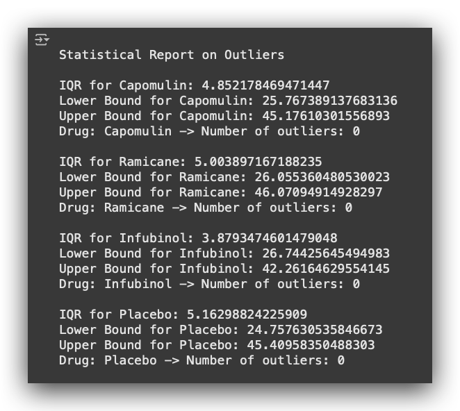
For each medication, I want to calculate the following:
- The IQR (Interquartile Range),
- The Lower Bound and Upper Bound,
- The Number of Outliers (in this case, zero).
This report is highly practical and can be used in almost any data analysis project. But how do we get there?
First, I’ll show you how to create this block: the outlier report for a single medication.

After that, we’ll automate the process to generate the report for all medications, agreed?
But for now, the goal is to focus on one medication at a time.
First, I’ll filter the data by medication to demonstrate the procedure for a single category.
This can be useful when you want to analyze only one specific category.
For example, if you have a variable with multiple categories, you’ll need to filter the data by the relevant category, which is what we’ll do here:
# 24. Filter the dataset by drug name
Capomulin_df = df_final.loc[df_final["drug"] == "Capomulin", :]
Ramicane_df = df_final.loc[df_final["drug"] == "Ramicane", :]
Infubinol_df = df_final.loc[df_final["drug"] == "Infubinol", :]
Ceftamin_df = df_final.loc[df_final["drug"] == "Ceftamin", :]
Notice that to apply the filter, I am using loc, and within the brackets, I’m following the Pandas slicing notation.
- Before the comma: Refers to the rows.
- After the comma: Refers to the columns.
For example, in the first filter:
- I select all rows where the medication is equal to Capomulin.
- After the comma, I include all columns.
This same approach is repeated for each category of the variable. Here’s an example, and we’ll print the first DataFrame to verify the result:
Capomulin_df.head()

Next, I’ll perform a groupby operation using mouse_id to retrieve the maximum timepoint.
What is the timepoint? It represents the specific moment when the medication was administered to the mouse. Here’s how we do it:
# 25. Group by 'mouse_id' and get the maximum 'timepoint' (last treatment for each mouse)
Capomulin_last = Capomulin_df.groupby('mouse_id').max()['timepoint']
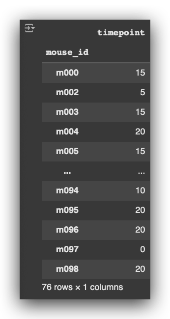
For example:
- The first mouse, m000, received the last medication at timepoint 15, which corresponds to 15 days.
- Mouse m002 received the last medication at timepoint 5, or 5 days.
- Mouse m003, 15 days; mouse m004, 20 days; and so on.
Notice the groupby notation:
- We group the data by mouse_id.
- We extract the maximum value using .max(), but only for the column timepoint, which gives the latest recorded instance for each mouse.
# 26. Convert the last treatment data into a DataFrame
Capomulin_volume = pd.DataFrame(Capomulin_last)
Next, I convert the result from #25 into a DataFrame, keeping the same structure but in a more manageable format for further operations.
# 27. Merge the last treatment DataFrame with the original data to keep only the final timepoint
Capomulin_merge = pd.merge(Capomulin_volume, Capomulin_df, on=("mouse_id", "timepoint"), how="left")
Then, I perform a merge. Why?
I take the initial filtered DataFrame and merge it with the volume DataFrame. By doing this, I replace the original timepoint column with the value of the last recorded timepoint for each mouse.

In the original column timepoint, you’ll notice multiple values for various mice that received the medication at different timepoints.
Now, I want to focus on only the last recorded medication for each mouse.
By performing the merge, I ensure that the resulting table includes only the rows corresponding to the final timepoint for each mouse.
Capomulin_merge.head()

Based on this table, I will extract the tumor volume in cubic millimeters.
Using this data, I will define the upper and lower bounds to prepare the outlier report.
What I’m demonstrating here is the step-by-step procedure for a single category of the variable. Later, we’ll automate this process to handle all categories.
Upper and Lower Bounds of the Data Distribution
We already have the filtered data. You might be wondering: Why did we calculate max()['timepoint']? Why was this step necessary?
The reason is that each mouse received multiple treatments over time.
By identifying the last timepoint, we ensure we are focusing on the final recorded measurement for each mouse. This allows us to calculate the outlier bounds based on the most relevant data.
# 25. Group by 'mouse_id' and get the maximum 'timepoint' (last treatment for each mouse)
Capomulin_last = Capomulin_df.groupby('mouse_id').max()['timepoint']
Each mouse received multiple medications over time. I want to focus on the last timepoint, the final recorded point in time when the mouse received the medication.
From there, I can calculate whether there are any outliers specifically related to the tumor volume at that point.
# 28. Extract tumor volume data for further analysis
Capomulin_tumors = Capomulin_merge["tumor_volume_mm3"]
Essentially, here’s what we’re doing: Each mouse received treatments over time. I’m focusing on the last timepoint to check whether there are any outliers in the tumor volume.
In other words, is there a mouse with a tumor significantly larger or smaller than expected? Are there values far from the data distribution? This approach offers a different perspective for analyzing the data.
I’m challenging you to think outside your comfort zone, considering how this can be applied in practice. It’s all about interpreting the problem and understanding the dataset.
By focusing on the last recorded treatment, we measure the tumor volume at that specific point. Now, with this information, I will calculate the quartiles for this variable.
# 29. Calculate quartiles for the tumor volume data
Cap_quartiles = Capomulin_tumors.quantile([0.25, 0.5, 0.75])
Once I calculate the quartiles using the quantile function, I will extract the first quartile (Q1) and the third quartile (Q3).
# 30. Extract the first (Q1) and third (Q3) quartiles
Cap_lowerq = Cap_quartiles[0.25]
Cap_upperq = Cap_quartiles[0.75]
Why? To calculate the IQR (interquartile range), which is obtained by subtracting the first quartile (Q1) from the third quartile (Q3).
# 31. Calculate the interquartile range (IQR)
Cap_iqr = Cap_upperq - Cap_lowerq
Based on this, I now calculate the lower and upper bounds for outlier detection.
# 32. Define lower and upper bounds for outlier detection
Cap_lowerbound = Cap_lowerq - (Cap_iqr * 1.5)
Cap_upperbound = Cap_upperq + (Cap_iqr * 1.5)
A widely used statistical rule is to work with 1.5 times the IQR. Thus, I calculate the lower bound as Q1 - (1.5 * IQR)and the upper bound as Q3 + (1.5 * IQR).
Any data point falling below the lower bound or above the upper bound is classified as an outlier.
I could have done this directly for the tumor_volume_mm3 without applying the max()['timepoint'] filter earlier. However, I intentionally added this additional step to filter the data.
The goal here is to specifically identify outliers based on the tumor_volume_mm3 at the last timepoint, which corresponds to the most recent treatment administered to the mouse.
# 33. Print quartiles, IQR, and outlier bounds for Capomulin tumor measurements
print(f"First Quartile of Tumor Volume with Capomulin: {Cap_lowerq}")
print(f"Third Quartile of Tumor Volume with Capomulin: {Cap_upperq}")
print(f"Interquartile Range (IQR): {Cap_iqr}")
print(f"Values below {Cap_lowerbound} may be outliers")
print(f"Values above {Cap_upperbound} may be outliers")
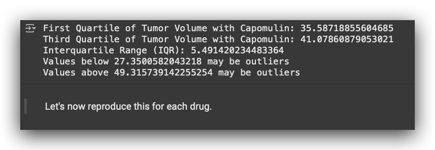
This is the outlier analysis report for a single medication.
It includes the first quartile (Q1), third quartile (Q3), interquartile range (IQR), and allows us to determine the bounds for outliers.
Values below 27 are classified as outliers, and values above 49 are also considered outliers. In this case, these bounds apply to the tumor_volume_mm3.
Why? Because I am applying the statistical rule to identify and filter outliers based on the tumor volume.
This process was done for a single category of the variable drug, while also considering the last timepoint of treatment for each mouse.
Are there outliers in each treatment?
Are there outliers in each treatment? To answer this, I will extract the last timepoint for each mouse. Below is the dataset for this step:
# 34. Extract the last timepoint for each mouse
last_timepoint = pd.DataFrame(df_final.groupby('mouse_id')['timepoint'].max().sort_values()) \
                    .reset_index().rename(columns={'timepoint': 'max_timepoint'})
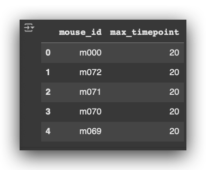
Notice that this process is being performed independently of the medication. I
am working with the entire dataset using df_final, without applying any filter for specific medications.
This approach ensures that the last timepoint is extracted for every mouse across the entire dataset.
# 35. Add the last timepoint as a column to the original DataFrame
merged_df = pd.merge(df_final, last_timepoint, on="mouse_id")
I add the last timepoint as a new column in the dataset. Here’s the column max_timepoint after merging:

After this, I check the column names to confirm the structure of the updated dataset:
# 37. Display column names of the cleaned dataset
df_final.columns

I create a list to store the tumor_volume_mm3 data for further analysis:
# 38. Initialize an empty list for tumor volume data
tumor_volume = []
Next, I create a list of medications to iterate over during the analysis:
# 39. List of treatments
treatment_list = ["Capomulin", "Ramicane", "Infubinol", "Placebo"]
Now, I use Question 1 to display the results for all medications.
This involves looping through each treatment in the treatment_list and performing the necessary calculations:
# a. Print the header for the statistical report
print(f"\nStatistical Report on Outliers")

# b. Loop through each drug in the treatment list
for drug in treatment_list:

    # c. Filter the DataFrame to get data for the current drug
    drug_data = merged_df.loc[merged_df["drug"] == drug]

    # d. Get the final tumor volume data at the last recorded timepoint for the drug
    final_volume = drug_data.loc[drug_data["timepoint"] == drug_data["max_timepoint"]]

    # e. Select the tumor volume column from the filtered data
    final_volumes = final_volume["tumor_volume_mm3"]

    # f. Append the final tumor volumes to the tumor volume list
    tumor_volume.append(final_volumes)

    # g. Calculate quartiles for the final tumor volumes
    quartiles = final_volumes.quantile([0.25, 0.5, 0.75])

    # h. Assign the first quartile to the variable `lowerq`
    lowerq = quartiles[0.25]

    # i. Assign the third quartile to the variable `upperq`
    upperq = quartiles[0.75]

    # j. Calculate the interquartile range (IQR)
    iqr = upperq - lowerq

    # k. Calculate the lower bound for outlier detection
    lower_bound = lowerq - (1.5 * iqr)

    # l. Calculate the upper bound for outlier detection
    upper_bound = upperq + (1.5 * iqr)

    # m. Count the outliers based on the defined bounds
    outliers = final_volumes[
        (final_volume["tumor_volume_mm3"] <= lower_bound) |
        (final_volume["tumor_volume_mm3"] >= upper_bound)
    ].count()

    # n. Print the statistical summary of outliers for each drug
    print(f"\nIQR for {drug}: {iqr}")
    print(f"Lower Bound for {drug}: {lower_bound}")
    print(f"Upper Bound for {drug}: {upper_bound}")
    print(f"Drug: {drug} -> Number of outliers: {outliers}")
I will create a loop for each drug in my treatment_list. Here's how it works:
- Merge the data for the current drug (#d) and locate the final tumor volume at max_timepoint.
- Select the tumor_volume_mm3 column from the filtered dataset (#e).
- Add the tumor volumes to a list for analysis (#f).
- Calculate the quartiles (#g), specifically the first quartile (Q1, #h) and the third quartile (Q3, #i), repeating the steps done earlier.
- Compute the interquartile range (IQR) (#j) and establish the lower and upper bounds for outliers.
- Filter the data to identify outliers (#m), which are values below the lower bound or above the upper bound.
Once the loop processes all drugs, it generates a complete report as shown below, including quartiles, IQR, bounds, and the count and values of outliers for each drug.
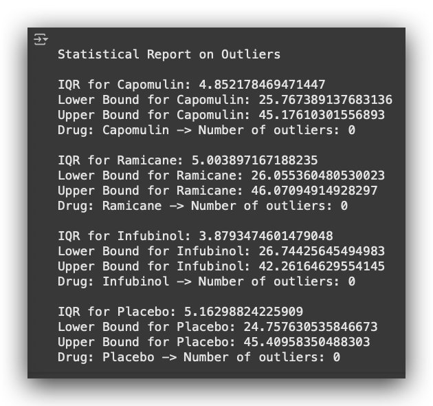
If I had jumped straight into this loop, it would likely have been harder to follow. That’s why I broke down the process for you step by step earlier.
Then, we automated everything using a repetition structure, in this case, a for loop.
Here’s the flow:
- I iterate over each drug, extract the desired information, calculate the statistics, and generate the results.
- In our case, there are no outliers.
- Note that I am focusing on the last timepoint when the drug was administered to the mouse.
- Based on that timepoint, I calculate the tumor volume and check: are there outliers or not? In our dataset, there are none.
Boxplot with Mean and Median
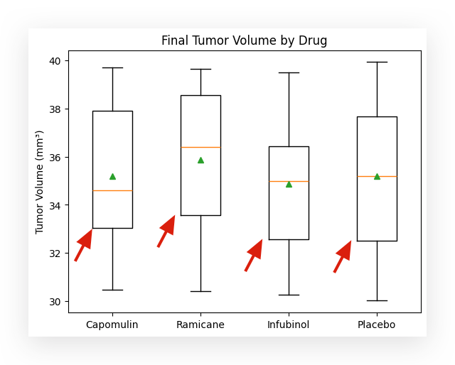
The boxplot is a useful tool for visualizing data distribution through quartiles. In the standard boxplot, you see:
- The first quartile (Q1),
- The second quartile (Q2), which is the median,
- The third quartile (Q3),
- The whiskers, representing the lower and upper bounds.
Any data point below or above the whiskers is classified as an outlier.
However, the standard boxplot does not include the mean. If you want to display the mean as well, here’s the trick:
Simply call the boxplot function from Matplotlib and add the parameter showmeans=True. Problem solved—easy as that! Another tool in your data visualization toolkit.
# 40. Create a boxplot to visualize the final tumor volume by drug
format = dict(marker="o")  # Customize outlier marker
plt.boxplot(tumor_volume, flierprops=format, showmeans=True)

# Add title and labels
plt.title("Final Tumor Volume by Drug")
plt.ylabel("Tumor Volume (mm³)")
plt.xticks([1, 2, 3, 4], ["Capomulin", "Ramicane", "Infubinol", "Placebo"])

# Display the plot
plt.show()
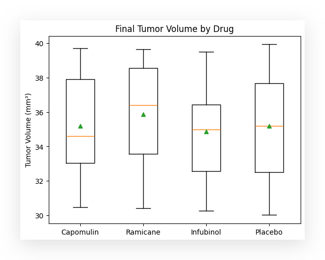
The number of people struggling to include the mean in a boxplot often stems from not fully understanding the tools at their disposal.
Matplotlib provides a dedicated boxplot function, and within this function, there are multiple parameters to customize the plot easily.
By leveraging these features, tasks like adding the mean become straightforward.

In this case, for each box in the boxplot, the following elements are displayed:
- The line below the box, forming the bottom of the rectangle, represents the first quartile (Q1).
- The yellow line inside the box marks the second quartile (Q2), which is the median.
- The line above the box, forming the top of the rectangle, represents the third quartile (Q3).

These lines at the top and bottom, known as the whiskers, represent the lower and upper bounds of the data distribution.
The green triangle indicates the mean. This feature is particularly useful because it allows you to quickly identify whether the mean is below, above, or aligned with the median.
This helps, for instance, in analyzing the behavior of a data distribution. In a normal distribution, the mean and medianare usually equal or very close. However, if there’s a difference between the mean and median, it suggests that the distribution is slightly skewed for that variable.
This insight becomes immediately accessible by simply adding a parameter like showmeans=True to the boxplot function.
Does Medication Affect Tumor Volume Over Time?
To avoid making the graph too cluttered, I will filter for a single mouse, specifically m000.
If desired, you can create the same graph for all mice, but that would result in a chart with 100 lines.
For simplicity and clarity, I’ll focus on just one mouse.
# 42. Extract data for a specific mouse
mouse_treatment = df_final.loc[df_final["mouse_id"] == "m000"]
I filter the data using the loc method.
Here, I specify that I want all rows corresponding to the mouse m000.
After filtering, I create a plot. By simply calling the plot method, Python automatically generates a line chart.
# 43. Plot tumor volume over time for a specific mouse
plt.plot(mouse_treatment['timepoint'], mouse_treatment["tumor_volume_mm3"], marker="o")

# Add labels and title
plt.xlabel("\nTime (days)")
plt.ylabel("Tumor Volume (mm³)")
plt.title("Treatment for Mouse m000")

# Display the plot
plt.show()
I specify the x-axis as timepoint and the y-axis as tumor_volume_mm3.
To represent the points, I set the marker to be a circle, resulting in the blue dots you see.
Finally, I add labels to the axes to make the chart clear and descriptive.
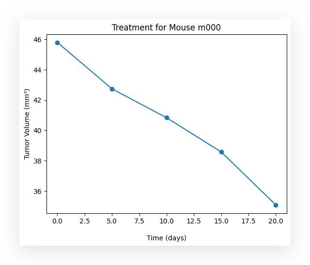
Over time, did the use of the medication have an effect on the tumor volume? Yes.
What happened? As time progresses, the medication appears to take effect, causing the tumor volume to decrease. Evidently, the medication is showing results, reducing the tumor size over time.
In this case, I am analyzing data for a single mouse to keep the graph clean.
However, you can extend this analysis to multiple mice if desired, though it may result in a more cluttered graph.
What is the relationship between the weight of the mouse and the tumor size?
This question aims to explore a relationship. When you encounter the term relationship, think about correlation, which is a key statistical measure.
Here, we are analyzing and studying this relationship. First, we will quantify the relationship and later attempt to predictthe behavior.
To begin, I will filter the data for a specific medication.
# 44. Filter data for Capomulin treatment
capomulin_treatment = df_final.loc[df_final["drug"] == "Capomulin"]
I will use just one medication in this case, as it’s practical to apply the same process to the others if needed.
I will now apply the filter, leaving only the data for a specific medication.
# 45. Display the first 5 rows of the filtered Capomulin treatment data
capomulin_treatment.head()

Next, I will display the dataset information using the info() method.
# 46. Display information about the Capomulin treatment dataset
capomulin_treatment.info()
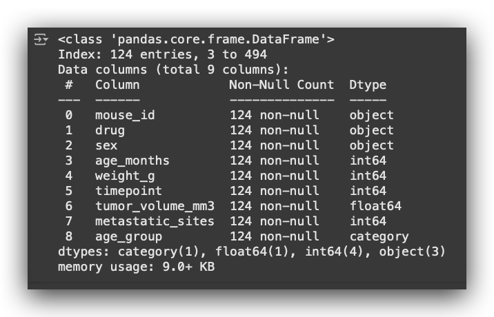
I will then calculate the mean, specifically for the numerical columns, by grouping the dataset by mouse_id.
This allows us to compute the average values for each mouse across the relevant numerical variables.
# 47. Calculate the mean for numeric columns, grouped by 'mouse_id'
avg_tumor_volume = capomulin_treatment.groupby('mouse_id')[['age_months',
                                                            'weight_g',
                                                            'timepoint',
                                                            'tumor_volume_mm3',
                                                            'metastatic_sites']].mean()
And a list of lists to calculate the mean — fascinating, isn’t it? You remember that I’ve used this bracket notation before, right? First, you group, and then you filter for the column you want. That’s exactly what I’m doing here.
But instead of filtering by a single column, I’m filtering by a list of columns. Each name here corresponds to a column in the dataset.
Who said I could only filter by one column? No, I can filter by as many as I want. If there’s more than one, I create a list of columns.
That’s what I’m doing here. So, I group the data, filter by specific columns, and then calculate the mean for each one.
# 48. Display the first 5 rows of the average tumor volume data
avg_tumor_volume.head()
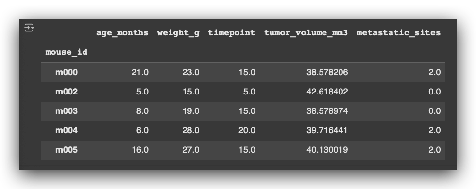
So, for each mouse, I calculate the mean age, mean weight, timepoint, tumor volume, and metastatic sites.
Of course, I ensure to calculate the mean only for the numerical variables.
Based on this data, I then create a scatterplot.
# 49. Scatter plot of mouse weight vs. average tumor volume
x_values = avg_tumor_volume["weight_g"]
y_values = avg_tumor_volume["tumor_volume_mm3"]

# Create scatter plot
plt.scatter(x_values, y_values)

# Add title and labels
plt.title("Mouse Weight (g) vs. Average Tumor Volume (mm³)")
plt.xlabel("\nWeight (g)")
plt.ylabel("Average Tumor Volume (mm³)")

# Display the plot
plt.show()
Here, I define the X-axis and the Y-axis. I then create the scatterplot, add the appropriate labels, and here is the result for you:
- X-axis: weight_g (mouse weight in grams).
- Y-axis: tumor_volume_mm3 (tumor volume in cubic millimeters).
The plot shows the relationship between the weight of the mice and their respective tumor volumes.
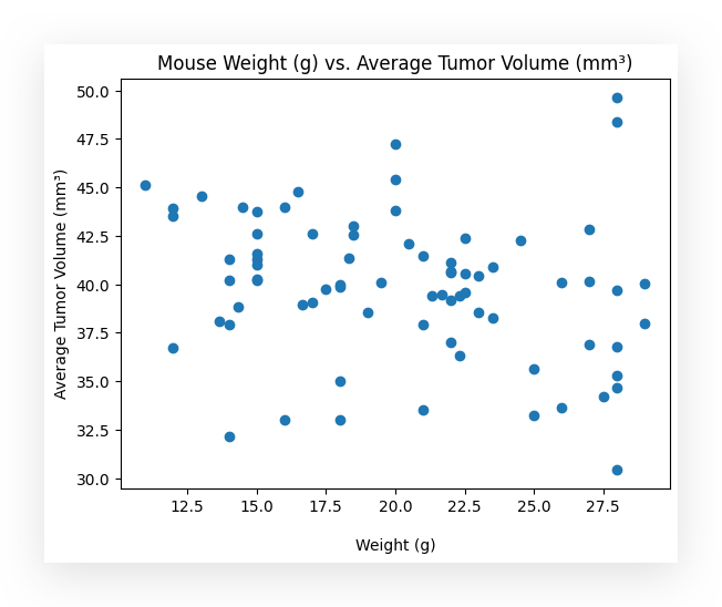
Can you identify, by looking at this chart, whether there is a relationship between the mouse’s weight, in grams, and the average tumor volume? Can you draw any conclusions?
Well, there seems to be a negative relationship. For now, I haven’t quantified it, I’m just observing the chart.
What does this negative relationship mean? If the tumor volume decreases, then you’re moving down the Y axis. As it decreases, the weight seems to increase.
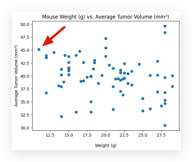
For example, take a look at this blue dot up here, okay? The average tumor volume is 45, and the weight is 10 grams.
Now, I’ll select this other point right here.
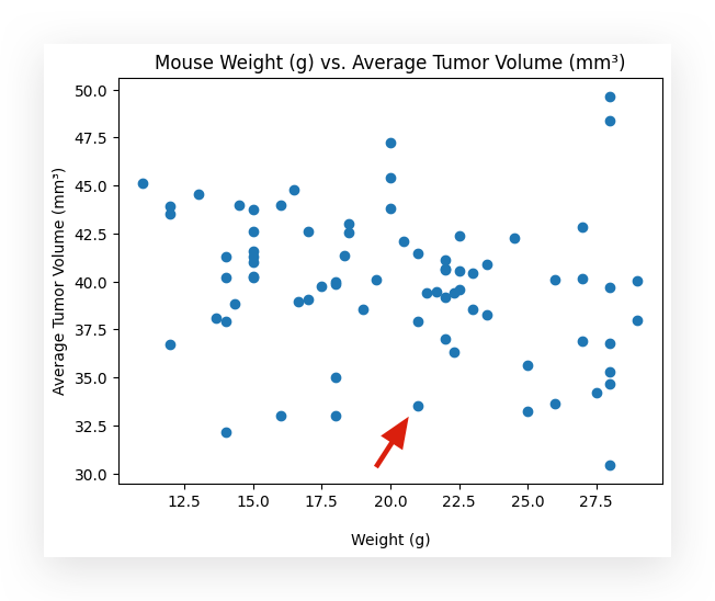
This point has a tumor volume of approximately 33. The weight is around 21 grams, more or less.
In other words, as the tumor volume decreases, the weight increases. This seems to be the relationship present in the dataset.
Well then, let’s calculate the correlation. I’ll use the Pearson correlation coefficient.
# 50. Calculate the Pearson correlation coefficient between weight and tumor volume
correlation_model = st.pearsonr(avg_tumor_volume["weight_g"], avg_tumor_volume["tumor_volume_mm3"])

# Print the correlation result
print(f"The correlation between Weight (g) and Tumor Volume (mm³) is {round(correlation_model[0], 2)}")

Notice that now it’s proving, more or less, what I had already observed in the graph.
The correlation between the two variables is -0.22.
- Correlation values range from -1 to +1:
- Close to -1: Strong negative correlation.
- Close to +1: Strong positive correlation.
- Close to 0: Indicates no correlation.
Observe that -0.22 is closer to 0 than to -1, meaning there’s a slight negative correlation.
As one variable decreases, the other tends to increase. However, this relationship is subtle, as evidenced both in the graph and by the calculated value.
Quantifying and Predicting the Relationship Through Linear Regression
The correlation coefficient provides a raw measure of the relationship between two variables.
The maximum information we can extract here is that there is a negative relationship between the two variables: the weight of the subject and the tumor volume.
The correlation value is -0.22.
If I want more detailed insights, I need to apply more advanced techniques.
One such option is linear regression. In this case, I’m using the linregress function from the SciPy library.
# 51. Create a linear regression model
model = st.linregress(avg_tumor_volume["weight_g"], avg_tumor_volume["tumor_volume_mm3"])
Who is ST? Where did that come from? It’s actually from scipy.stats.
We can perform regression using the Scikit-Learn package, StatsModels, or SciPy. In other words, Python offers multiple tools for implementing the linear regression algorithm.
Here, I’m taking the opportunity to introduce another alternative: SciPy.
I prepare the model, specify the variables to analyze their relationship, and then the model is created.
Once the model is built, it provides two coefficients: the intercept and the slope.
# 52. Display the intercept of the linear regression model
model.intercept

# 43.1616906149073

# 53. Display the slope of the linear regression model
model.slope

# -0.16303360099718336
With these two coefficients, we can construct the regression formula, which is:
y = β0 + β1x
Where:
- β0 and β1 are the coefficients,
- x is the input data, and
- y is the output data.
Now, it’s just a matter of building the formula. I’ll use weight as the input data (xx) to analyze the tumor volume (yy) based on it.
# 54. Create the regression formula using the coefficients from the model
regression_model = model.intercept + model.slope * avg_tumor_volume["weight_g"]
I then construct the exact regression formula:
Where:
- β0 is the intercept,
- β1 is the slope,
- and x, in this case, is the average weight.
This gives us the model, which, in practice, predicts y — the tumor volume based on the input x.
# 55. Calculate the regression line equation
line_equation = f"y = {round(model.slope, 2)}x + {round(model.intercept, 2)}"
I will then draw the regression line and overlay it on a scatterplot.
I’ll use the same scatterplot as before, but now I’ll include the regression line for better visualization.
# 56. Plot scatter points and regression line for Capomulin

# Scatter plot of weight vs. tumor volume
plt.scatter(avg_tumor_volume["weight_g"], avg_tumor_volume["tumor_volume_mm3"], color="r")

# Plot regression line
plt.plot(avg_tumor_volume["weight_g"], regression_model, color="blue")

# Add labels and title
plt.xlabel("\nWeight (g)")
plt.ylabel("Tumor Volume (mm³)")
plt.title("Weight (g) vs. Tumor Volume (mm³) for Capomulin")

# Annotate the regression equation on the plot
plt.annotate(line_equation, (20, 36))

# Show the plot
plt.show()
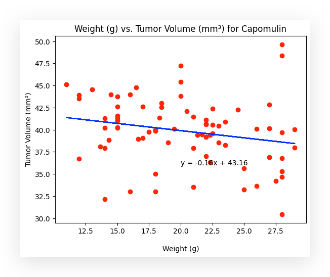
I am now quantifying and predicting tumor volume based on the weight of the mice. The regression line makes the relationship clear.
Notice that the line is diagonal, indicating a negative correlation: as the weight of the mouse increases, the tumor volume decreases.
Why does this happen? There is a negative relationship between the variables.
This means that as the tumor volume decreases, the mouse’s weight increases. In other words, the smaller the tumor, the greater the potential for weight gain, possibly due to improved health or other related factors.
This analysis provides another statistical insight based on the regression study of the variable relationship. Now, you can input any weight value, and I will be able to predict the tumor volume.
That’s exactly what the regression line offers, and I even included the mathematical formula within the graph itself for your reference.
Delivering the Analysis Results
In this project, I presented a series of concise statistical reports, each offering insights into specific aspects of the dataset.
These reports can now be consolidated into a comprehensive analysis to share with decision-makers.
For instance, you could use the Jupyter Notebook itself as a dynamic presentation tool or export the findings into a PowerPoint presentation, highlighting conclusions, tables, and visualizations in a clear and engaging format.
This approach ensures that decision-makers receive actionable insights, backed by data and visuals that make the analysis transparent and impactful. With this project complete, you’re ready to move on to the next challenge!
Thank you for following along! 🐼❤️
All images, content, and text by Leo Anello.
Statistical Analysis Using Python: Insights from Cancer Treatment Data was originally published in Towards Data Science on Medium, where people are continuing the conversation by highlighting and responding to this story.
from Datascience in Towards Data Science on Medium https://ift.tt/iLJfUzN
via IFTTT


