Step-by-Step Guide for Building Waffle Charts in Plotly
Learn how to create custom waffle charts in Python using Plotly for data visualization
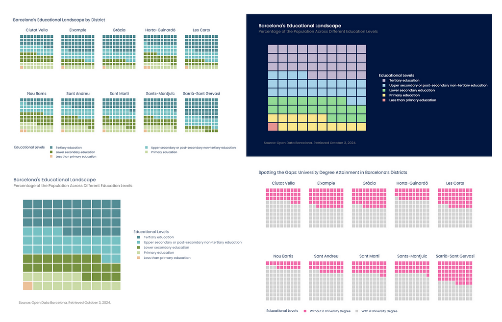
Plotly is one of the most complete libraries for visualizing data in Python and, without a doubt, my favorite. It has a wide range of visualizations already defined, from basic visualizations, such as bar charts or pie charts, to more specific visualizations from the statistical or data science area, such as box plots or dendrograms.
The visualization options offered by Plotly are pervasive; however, some visualizations are not available in the library. This does not mean that we cannot do them. With a little ingenuity, and using the customization and visualization options present in Plotly, it is possible to create many visualizations that, a priori, were impossible to do. One of them is the waffle charts.
This article will explain how to create waffle charts using Plotly. Starting with a heatmap and a little imagination and creativity, we will see how the creation of this type of visualization is easier than it seems.
1. Why Choose Waffle Charts?
Waffle charts are an interesting alternative to pie charts or bar charts when you want to visualize proportions using an alternative layout. In pie charts, it is difficult to distinguish proportions concerning the data as a whole, which is much easier to achieve with waffle charts.
Waffle charts are used to visualize categorical data. They usually consist of 100 squares arranged in a 10 by 10 grid. Waffle charts use different colors to show how different groups or categories contribute to the total. Each cell in the chart represents 1% of the 100% total.
In Python, there are open-source libraries dedicated exclusively to creating Waffle Plots, such as PyWaffle. However, in Plotly there is no custom graph, neither in Plotly Graph Objects nor in Plotly Express, to perform this type of visualization. In the following section, we will explain step by step how to create waffle charts in Plotly, so that you can add them to your custom reports in a Jupyter Notebook or, for example, to your web applications made in Streamlit.
2. Step-by-Step Guide to Building Waffle Charts in Plotly
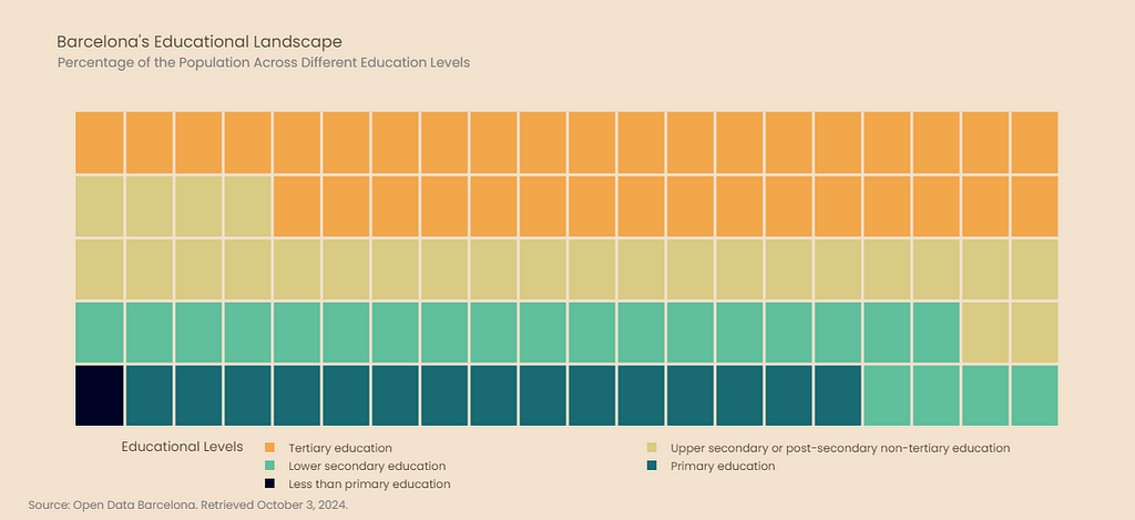
The objective is to explain step-by-step how to design the following waffle chart. It shows the percentage of the population belonging to the different educational levels in Barcelona. The visualization consists of the waffle chart, a legend, a subtitle, and a footer. Below, we explain in detail how to create each of these elements, so that you can understand the construction of the code and easily adapt it to your use case.

Data Acquisition from Open Data Barcelona
The data needed to perform the above visualization were obtained from the open data platform of Barcelona city, Open Data Barcelona.
The selected dataset contains the population of Barcelona aged 16 and over, aggregated by academic qualifications and sex, according to the Municipal Register of Inhabitants as of January 1 of each year. To download it, you can access the following link:
We need to read the data and perform the necessary preprocessing to use it later in creating our waffle diagram. Open Data Barcelona data, as a general rule, is of excellent quality; therefore, the necessary processing is minimal. In this case, it has only been necessary to replace missing values coded as .. by 0.

As seen above, data segregation is done by district, neighborhood, and census tract. A district comprises different neighborhoods and a neighborhood of different census tracts. Additionally, segregation is also done by sex and academic level. The data will be grouped only by academic level in this first visualization. However, in later sections of the article, other groupings will be made to create multi-panel waffle diagrams, with more granular information.
Data Transformation for Waffle Chart Visualizations
It is necessary to transform the data from the table above into a format suitable for the Waffle Chart. First, we will obtain a series of Pandas with the percentage of the population at each educational level. Since the percentages contain decimals, an approximation of the data will be made to visualize them in our chart. This approximation consists of rounding all values to add up to 100, the total number of squares in our Waffle Chart. Additionally, because there is a category in the data set that does not contain any values, it will be removed from the series.
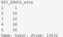
As can be seen, the educational levels are coded in numbers, from 1 to 5. These labels need to be more intuitive to understand the data. Open Data Barcelona contains a file detailing the encodings used in the datasets available on the platform. With this information, a mapping will be made with the meaning of each number that encodes the educational level.

Creating Heatmap to Represent Percentages
The basis of the waffle chart will be made in Plotly with a heatmap. The number of cells corresponding to each educational level depends on the percentage of the population at that level, so each cell represents 1%.
Before creating the heatmap, a grid will be made, where the code for each level will be repeated according to the percentage. The grid is a NumPy array of size 10x10, which will later be the size of the heatmap we will create. The following shows the creation of the grid and the resulting array.
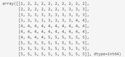
This vector representing the percentages will be used to build the heatmap. The following function is responsible for creating the heatmap. As can be seen, the heatmap created is simple; it does not contain a grid or any legend and is inadequately sized.

This base heatmap will be customized to create the final waffle chart. First, we must add a grid to separate the different squares that make up the heatmap. The grid will be created by a scatter plot formed by a white line. This scatter plot is added to the visualization as an additional trace.
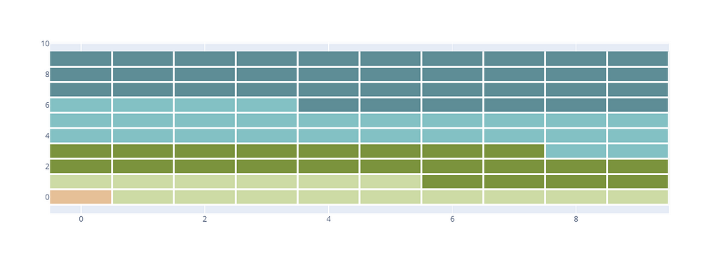
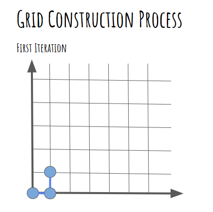
The grid construction is based on adding a bottom edge and a side edge in each of the iterations. The following image shows the edges created in the first iteration of the for loops. In this iteration, three points or coordinates are generated which, in the scatter plot, result in the bottom edge and the side edge shown in the image.
Adding a Legend to the Heatmap
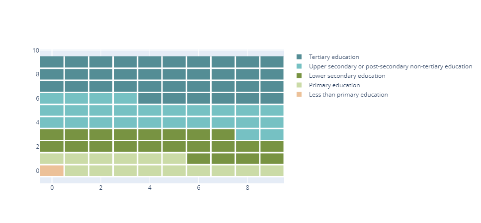
Once the base heatmap has been created, the next step is to create a legend showing the category meaning on the map, which corresponds to different educational levels. To create the legend, we simulate the creation of a scatter plot where the markers are squares. The scatter plot will not be provided with data so only the legend is generated. The following code shows the creation of the legend, which is added to the previously created visualization.
Optimizing Visual Presentation: Layout Customization, Subtitles, Footers, and Font Styling
There are general rules for making any visualization look much more professional. For example, using a motivating subtitle, appropriate typography, or a footer with information about the source from which the data has been extracted are small details that make the visualization look much more sophisticated and do not cost much to implement.
The following article explains some elements that can be easily added to visualizations in Plotly to make them look much more professional.
Seven Key Features You Should Know for Creating Professional Visualizations with Plotly
The font selected for the created waffle chart is Poppins. Ninad Kale designed this font, which can be used for free. It will not be installed on your computer by default, so you must download and install it. Otherwise, the font displayed when executing the above code will not be Poppins. The download can be done from the following link.
By selecting Get Font and then Download All, a compressed file with the font will be downloaded. Once downloaded, we will proceed to install the font. I recommend you watch the following video to learn the steps and perform the installation successfully.
Regarding the layout, some modifications have been made. For example, a completely white background has been set to avoid the gray stripes surrounding the heatmap. We have also adjusted the position of the legend, and the size image and removed the x and y axes.
The create_layout function contains all the modifications described above. The result of adding this function to all the previously described code is the final visualization.
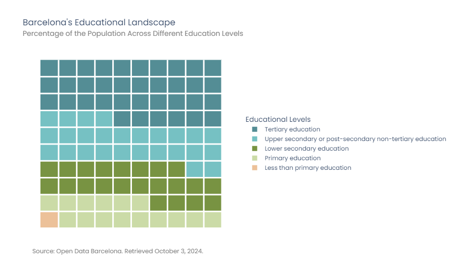
Putting all the above code together, we will get the following result. Process finished!

3. Exploration of New Heatmap Designs
Plotly visualizations are highly customizable, so we can explore new designs simply by changing a few parameters in our code.
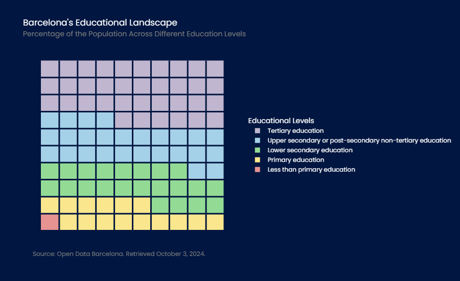
The following visualization shows the waffle chart created earlier in dark mode. To achieve this, five parameters have been modified: (1) the color scale of the heatmap, (2) the background color of the visualization, (3) the paper color, (4) the grid color, all of them to navy blue, and (5) the font color to white.
The type of colors used in the graphic can be easily modified. The following visualization uses a vintage palette. In addition, the size of the heatmap has been adjusted to a 20x5 grid. Due to this modification, the position of the legend and the size of the image have also been adjusted.
As you have seen, the customization options are immense. Now it’s up to you to be creative and adapt the design to your preferences or the corporate design of your organization.
4. Creating Multi-Plot Waffle Charts in Plotly
The previous example showed how to create a single waffle chart, showing the percentage of the population in each educational level in Barcelona. However, we can combine several waffle charts into a single diagram to visualize the differences between categories, in this case, between different neighborhoods in the city.
We have used the functions defined in the previous section to make this visualization.
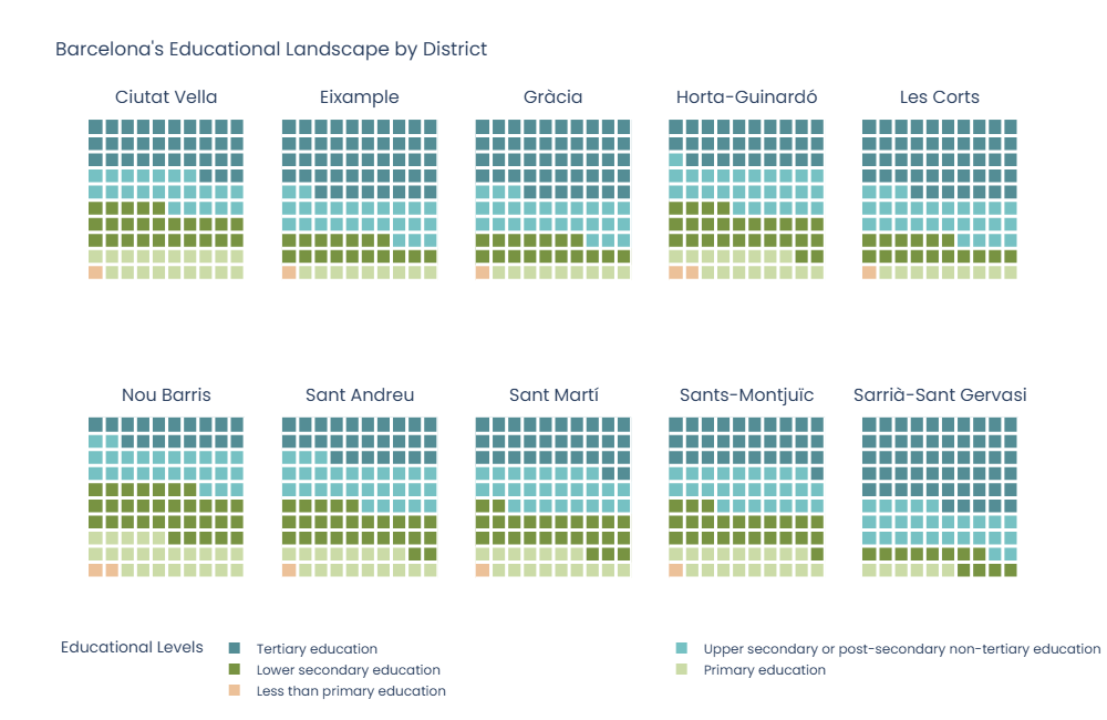
It can be observed that in all neighborhoods the majority of the population has at least primary education. However, concerning university studies, significant differences between neighborhoods can be observed.
5. Highlighting Key Insights in Waffle Charts to Deliver a Clear Message
One of the elementary conditions for designing a good waffle chart is to ensure that there are only a few categories, otherwise, it would be difficult to see the percentage differences between them. In the above diagrams, there are 5 possible educational levels, so we can see the differences between them without any problems. However, it could be the case that we want to send a specific message and highlight only one of these categories.
The following diagram shows the percentage of the university population versus the non-university population. All educational levels other than university have been grouped into a single category to highlight these two groups' differences. The visualization was created using the same code as above; only the input data for the function was modified.
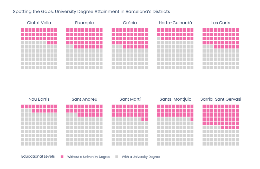
As can be seen, there are districts such as Les Corts, Sarrià-Sant Gervasi, Eixample, or Gràcia with a percentage of the university population close to 50%. On the contrary, there are other districts such as Nou Barris, where the percentage of the university population does not reach 20%. These differences, if we were to make a more exhaustive analysis, we would see that they coincide with the economic differences in terms of the income level of the different neighborhoods.
6. Beyond Waffle Charts: Exploring Additional Data Visualizations You Can Create
The additional visualizations that you can create from those implemented in Plotly are numerous; you just need to use a little imagination. Another useful type of visualization that you can also create from heatmaps is calendars. The following calendar, created in Plotly, shows all the holidays in Barcelona in 2024.
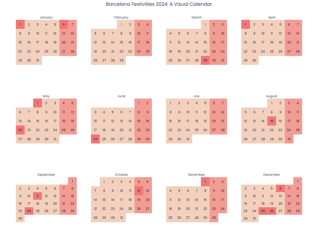
The following article explains in detail how to create the above calendar. The article includes all the necessary code to perform the visualization.
Step-by-Step Guide for Building Interactive Calendars in Plotly
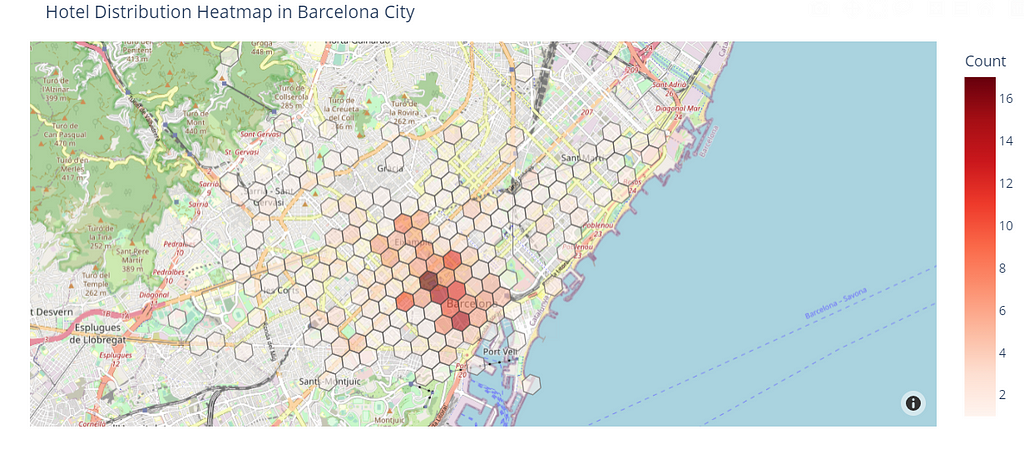
Another visualization that can be created from existing graphs are hexagon maps. This type of map is an interesting alternative to administrative choropleth maps, as it allows a better visualization of how a variable is distributed over a territory. In choropleth maps, the larger administrative boundaries tend to have a greater weight in the representation. Alternatively, hexagonal maps divide the territory into equal areas using a hexagonal grid. This allows a homogeneous representation of the variable throughout the territory and facilitates the detection of areas where data are concentrated.
The following hexagon map shows the distribution of hotels in the city of Barcelona. The hexagons with more hotels are represented in the graph with reddish shades. On the contrary, the hexagons with few hotels are shown in light tones.
The following article shows in detail all the steps to create the above visualization, including the code needed to perform it.
Constructing Hexagon Maps with H3 and Plotly: A Comprehensive Tutorial
As you can see, Plotly offers a great deal of customization from the visualizations already available; you just need to be a little creative to create the visualization you want.
In Plotly there was no predefined visualization to create Waffle Charts; however, that does not mean it is impossible to create them. With a little ingenuity, we have combined the visualizations already available in Plotly to obtain a waffle chart. Waffle charts are handy when you want to visualize percentage distributions in an attractive format for the user, being a perfect alternative to bar or pie charts.
This article explains how to create waffle charts in Plotly, following good design principles. You can now create them and incorporate them into Streamlit applications or reports in Jupyter Notebooks, allowing you to present your data in a visually appealing and interactive way. Waffle charts will not only allow you to quickly understand percentage data, but they are also a modern way of presenting it.
Step-by-Step Guide for Building Waffle Charts in Plotly was originally published in Towards Data Science on Medium, where people are continuing the conversation by highlighting and responding to this story.
from Datascience in Towards Data Science on Medium https://ift.tt/oycVrHY
via IFTTT


